


News for Interior Design
- Detailseite Inhalt (Text) deutsch:
"Step by Step" living room styling process
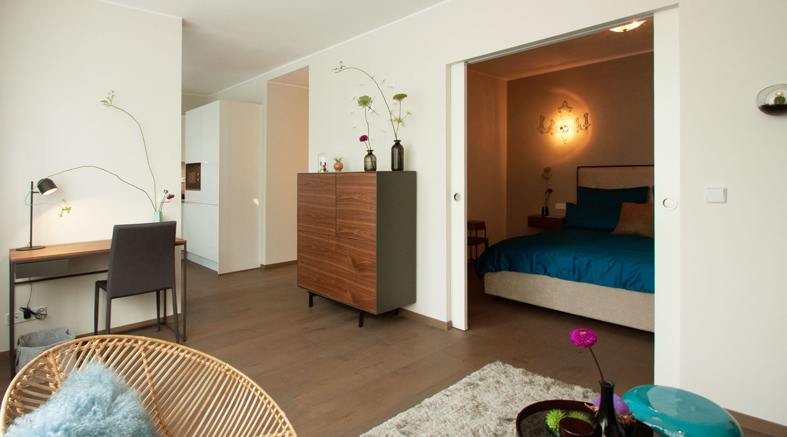
The idea behind this home styling project in Charlottenburg was to work with neutral but warm colors and make them look particularly refreshing with turquoise accents. The biggest challenge was to find small-scale furniture with full comfort and functionality to avoid making the little apartment look cramped.
The before-and-after comparison of the living room speaks volumes and nicely illustrates all that can be achieved when starting with an empty apartment.
- Listing Bild links - Text rechts (optional):
- Sub Bild (Bild links / Text rechts):
 , Sub Text (Bild links / Text rechts):
The bare bones space on day one. (The bedroom is off to the left) Let the work begin ..., Sub Überschrift (Bild links / Text rechts):
Step 1: Bare living room shell
, Sub Text (Bild links / Text rechts):
The bare bones space on day one. (The bedroom is off to the left) Let the work begin ..., Sub Überschrift (Bild links / Text rechts):
Step 1: Bare living room shell - Sub Bild (Bild links / Text rechts):
 , Sub Text (Bild links / Text rechts):
The living room gets a fresh coat of paint; the wall behind the sofa is finished in a darker shade of cream. All other walls are painted off-white. Some of the furniture was delivered that day and the ceiling light was installed., Sub Überschrift (Bild links / Text rechts):
Step 2: Wall colors
, Sub Text (Bild links / Text rechts):
The living room gets a fresh coat of paint; the wall behind the sofa is finished in a darker shade of cream. All other walls are painted off-white. Some of the furniture was delivered that day and the ceiling light was installed., Sub Überschrift (Bild links / Text rechts):
Step 2: Wall colors - Sub Bild (Bild links / Text rechts):
 , Sub Text (Bild links / Text rechts):
The anthracite-colored sofa with Alcantara upholstery is absolutely easy-care. To make the living room even cozier, we complemented the side table and highboard with European walnut. A light and airy summer vibe is created by means of the supremely comfortable rattan armchair., Sub Überschrift (Bild links / Text rechts):
Step 3: Harmonious furnishing
, Sub Text (Bild links / Text rechts):
The anthracite-colored sofa with Alcantara upholstery is absolutely easy-care. To make the living room even cozier, we complemented the side table and highboard with European walnut. A light and airy summer vibe is created by means of the supremely comfortable rattan armchair., Sub Überschrift (Bild links / Text rechts):
Step 3: Harmonious furnishing - Sub Bild (Bild links / Text rechts):
 , Sub Text (Bild links / Text rechts):
An eye for detail gives every room a very special touch and underscores its uniqueness. Color-coordinated accessories are used. In this case, glass globes with succulents as wall decor and the matching kingfisher as a decorative glass object., Sub Überschrift (Bild links / Text rechts):
Step 4: An eye for details
, Sub Text (Bild links / Text rechts):
An eye for detail gives every room a very special touch and underscores its uniqueness. Color-coordinated accessories are used. In this case, glass globes with succulents as wall decor and the matching kingfisher as a decorative glass object., Sub Überschrift (Bild links / Text rechts):
Step 4: An eye for details - Sub Bild (Bild links / Text rechts):
 , Sub Text (Bild links / Text rechts):
As a gorgeous contrast to the combination of walnut, anthracite, turquoise and petrol, we have chosen such unusual pieces as artichokes and the raspberry-colored dahlia, which elevate the setting into a real eye-catcher., Sub Überschrift (Bild links / Text rechts):
Step 5: Flowers and vases
, Sub Text (Bild links / Text rechts):
As a gorgeous contrast to the combination of walnut, anthracite, turquoise and petrol, we have chosen such unusual pieces as artichokes and the raspberry-colored dahlia, which elevate the setting into a real eye-catcher., Sub Überschrift (Bild links / Text rechts):
Step 5: Flowers and vases
- Sub Bild (Bild links / Text rechts):
- Listing Bild oben - Text darunter (optional):
- Sub Bild (Bild oben / Text darunter):
 , Sub Text (Bild oben / Text darunter):
Afterwards: ET VOILA
Beautiful home = beatiful feeling = beautiful living
Home staging services and packages at a glance
Whether furniture or colors, a harmonious and coherent concept is the be-all and end-all when staging a kitchen.
As a professional home stager, I draw on my expertise to imbue your home with a unique look. I offer three different home staging packages:
- Home Staging 1 Basic:
- This package is recommended for owners who want to independently upgrade their occupied property and seek professional advice in doing so.
- Home Staging 2 package:
- This package is aimed at owners who have a rough vision but are unsure how to implement their ideas. Here we work together to realize a concept and prepare the apartment for a profitable sale.
- Home Staging 3 complete package:
- With this stress-free, turnkey package, you entrust the upgrading of your property to professionals. Perfect for busy clients who don't have time but still want to have their home given a unique makeover.
- Home Staging 1 Basic:
- Sub Bild (Bild oben / Text darunter):
- Detailseite Inhalt (Text) deutsch:
Restful sleeping and hideaway spot
The objective of this home styling project was to create a self-contained bedroom within a 60s studio apartment. Warm, neutral wall colors with turquoise accents, which run through this space like a common thread, extend to the bedroom with its petrol-toned bed linen. The biggest challenge with regard to this very small space, which was partitioned off for sleeping and resting, was the sourcing of perfect furniture for it. This furniture must offer maximum comfort while making optimum use of the small space available. To this end, we had a floor-to-ceiling closet custom-made. Distinctive sliding doors to match the wall colors camouflage this exquisite storage space. The more storage space the better - especially in small rooms.
Creating a new bedroom "Step by Step" nicely illustrates how it takes a professional eye to create this kind of magic space.
- Listing Bild links - Text rechts (optional):
- Sub Bild (Bild links / Text rechts):
 , Sub Text (Bild links / Text rechts):
The real estate agency wanted a separate bedroom for this unit. We therefore partitioned off a section of the studio apartment with drywall. The plan is to anchor two sliding doors to the right and left in the drywall construction., Sub Überschrift (Bild links / Text rechts):
Step 1: Shell and drywall construction
, Sub Text (Bild links / Text rechts):
The real estate agency wanted a separate bedroom for this unit. We therefore partitioned off a section of the studio apartment with drywall. The plan is to anchor two sliding doors to the right and left in the drywall construction., Sub Überschrift (Bild links / Text rechts):
Step 1: Shell and drywall construction - Sub Bild (Bild links / Text rechts):
 , Sub Text (Bild links / Text rechts):
The new wall is now fitted out with internal sliding doors. We deliberately coated the door surface in the same color as the wall to create the impression of a seamless wall, with no optical interruption where material or color is concerned., Sub Überschrift (Bild links / Text rechts):
Step 2: Finished sliding doors
, Sub Text (Bild links / Text rechts):
The new wall is now fitted out with internal sliding doors. We deliberately coated the door surface in the same color as the wall to create the impression of a seamless wall, with no optical interruption where material or color is concerned., Sub Überschrift (Bild links / Text rechts):
Step 2: Finished sliding doors - Sub Bild (Bild links / Text rechts):
 , Sub Text (Bild links / Text rechts):
The wall behind the bed will be painted in a darker hue. The same exact shade in fact as the wall behind the living room sofa.
This shade of paint too is from the same color series that provided the lighter tone used for all the other walls in this apartment. The color intensity changes with the light conditions, thus creating an interesting sense of space.
, Sub Überschrift (Bild links / Text rechts):
Step 3: Cozy wall colors
, Sub Text (Bild links / Text rechts):
The wall behind the bed will be painted in a darker hue. The same exact shade in fact as the wall behind the living room sofa.
This shade of paint too is from the same color series that provided the lighter tone used for all the other walls in this apartment. The color intensity changes with the light conditions, thus creating an interesting sense of space.
, Sub Überschrift (Bild links / Text rechts):
Step 3: Cozy wall colors - Sub Bild (Bild links / Text rechts):
 , Sub Text (Bild links / Text rechts):
Storage space is crucial in small rooms and apartments. Ceiling-high, built-in wardrobes are not only eye-catching, they also offer maximum storage space. I prefer to dispense with the classic bedroom closet in my room designs, as full-height sliding doors offer a wealth of design options., Sub Überschrift (Bild links / Text rechts):
Step 4: New building storageNeu Einbauschrank
, Sub Text (Bild links / Text rechts):
Storage space is crucial in small rooms and apartments. Ceiling-high, built-in wardrobes are not only eye-catching, they also offer maximum storage space. I prefer to dispense with the classic bedroom closet in my room designs, as full-height sliding doors offer a wealth of design options., Sub Überschrift (Bild links / Text rechts):
Step 4: New building storageNeu Einbauschrank - Sub Bild (Bild links / Text rechts):
 , Sub Text (Bild links / Text rechts):
Installation of all ceiling and wall lights. Even though these lights are rather playful, and can hardly be considered "neutral and discrete", here we took our cue from the client who wanted "a touch of sophisticated luxury in the bedroom”., Sub Überschrift (Bild links / Text rechts):
Step 5: Ceeling ligth instalation
, Sub Text (Bild links / Text rechts):
Installation of all ceiling and wall lights. Even though these lights are rather playful, and can hardly be considered "neutral and discrete", here we took our cue from the client who wanted "a touch of sophisticated luxury in the bedroom”., Sub Überschrift (Bild links / Text rechts):
Step 5: Ceeling ligth instalation - Sub Bild (Bild links / Text rechts):
 , Sub Text (Bild links / Text rechts):
An upholstered headboard ensures coziness and warmth. Many headboards come with removable fabric covers for easy cleaning. A high-quality barrel pocket spring mattress ensures excellent air circulation and thus a good nights’ sleep., Sub Überschrift (Bild links / Text rechts):
Step 6: New bed has arived
, Sub Text (Bild links / Text rechts):
An upholstered headboard ensures coziness and warmth. Many headboards come with removable fabric covers for easy cleaning. A high-quality barrel pocket spring mattress ensures excellent air circulation and thus a good nights’ sleep., Sub Überschrift (Bild links / Text rechts):
Step 6: New bed has arived - Sub Bild (Bild links / Text rechts):
 , Sub Text (Bild links / Text rechts):
Premium silk bed sheets along with sumptuous pillows and, if you like, a fur bedspread can easily transform a small bedroom into a spot of pure luxury., Sub Überschrift (Bild links / Text rechts):
Step 7: Bed linen & co
, Sub Text (Bild links / Text rechts):
Premium silk bed sheets along with sumptuous pillows and, if you like, a fur bedspread can easily transform a small bedroom into a spot of pure luxury., Sub Überschrift (Bild links / Text rechts):
Step 7: Bed linen & co
- Sub Bild (Bild links / Text rechts):
- Listing Bild oben - Text darunter (optional):
- Sub Bild (Bild oben / Text darunter):
 , Sub Text (Bild oben / Text darunter):
Afterwards: ET VOILA
Good, healthy sleep is known to make you look your best. And waking up the next morning, your first view is of the sunny, open living area.
Where's my latte macchiato?
Home staging services and packages at a glance
Whether furniture or colors, a harmonious and coherent concept is the be-all and end-all when staging a kitchen.
As a professional home stager, I draw on my expertise to imbue your home with a unique look. I offer three different home staging packages:
- Home Staging 1 Basic:
- This package is recommended for owners who want to independently upgrade their occupied property and seek professional advice in doing so.
- Home Staging 2 package:
- This package is aimed at owners who have a rough vision but are unsure how to implement their ideas. Here we work together to realize a concept and prepare the apartment for a profitable sale.
- Home Staging 3 complete package:
- With this stress-free, turnkey package, you entrust the upgrading of your property to professionals. Perfect for busy clients who don't have time but still want to have their home given a unique makeover.
- Home Staging 1 Basic:
- Sub Bild (Bild oben / Text darunter):
- Detailseite Inhalt (Text) deutsch:
The endless Options in the World of Colors
The effect of colors on a person’s well-being is enormous. One the one hand, colors have a direct effect on the psyche and, on the other hand, they also influence us indirectly through the room’s atmosphere. The size of a room and the room’s temperature is perceived subjectively by people. Each color has a different effect and thus, each color also gives a room a different feel.
Light colors (yellow, orange, etc.) have the effect of making a room’s dimensions appear bigger. Dark colors, on the other hand, make a room appear smaller. Warm colors (red shades, for example) give the sensation of heat and actually make a room seem warmer while cold colors make a room seem a bit cooler. Pastel tones have a powerful yet delicate effect, which is why I only list the primary colors here.
To help you choose the right wall color intensity, have a small batch of color blended for you at the DIY market. Paint a small wall surface with it and let its impact on you – both in daylight and in artificial light – sink in. A color’s effect will change with the time of day and outdoor light conditions.
Here’s a little tip when it comes to choosing the wall color: Every DIY market has color charts that you can take home with you. If you opt for one of the colors presented on the chart, have it blended 1 or 2 nuances lighter than the chosen color. That’s because colors will look more intense on a large wall.
And here’s a guide to follow with regard to the effect of certain colors in a room. It will help inspire some interior design ideas.
Yellow brings summer into your rooms
Yellow brings summer, sun and a good mood into your home. Yellow lends a room a sunny, positive atmosphere; it lets small rooms look bigger and it’s both stimulating and revitalizing. It has this effect both on the spirit and on your intellectual activities. The color yellow boosts one’s ability to concentrate and one’s eagerness to learn, thus impacting the brain positively. Yellow stimulates the mind and is conducive to conversation. Yellow even exerts this effect in combination with dark colors. It’s the ideal choice for rooms meant for young people and for conference rooms. Yellow as a wall color is invigorating and warming.
Orange brings cheerfulness into your home
Orange has a stimulating effect, exuding warmth and hygge. It’s a friendly, sociable and nurturing color. Orange also stimulates the appetite and encourages conviviality. When orange is lightened with white it loses its radiance. It’s the ideal color for kitchens and dining rooms and perfect for North-facing rooms with only very little natural light or sun. Orange as a wall color gives a room added warmth.
Red brings power and vital energy
Red is the most dynamic and aggressive of all colors. Red is mentally and physically stimulating in terms of physical labor and movement. When it comes to interior design, red injects dynamism and ideas. Red should not be the dominating color in rooms in which you want to relax because red is pure energy. This color increases the body’s metabolism and stimulates blood circulation. Red stirs passion and a desire for sexual pleasure and it makes people happy. Too much red in a room will make you restless and irritable after a while; it is also a little bit constricting. Red, by the way, also stimulates appetite (just like orange). Individuals who struggle with their weight should opt for blue or blue-green in their kitchens. Red rooms give the sensation of warmth and using a lot of red in a room saves on heating costs. Red as a wall color is rather loud; all all-red room can make it seem like the walls are closing in.
Pink brings love and empathy to your home
Pink is soothing and makes one more receptive to other people’s moods; it breaks down aggression. According to experts, it’s the best color for bedrooms. American basketball teams routinely offer opposing teams pink dressing rooms. Pink as a wall color is delicate, fresh and spring-like.
Violet conveys an almost sacral, classy mood
Violet goes hand in hand with a festive mood. Violet is ceremonious and suitable for reception rooms. When used in living quarters, violet can generate a sacral mood over time. Violet makes one passive and calms one down. Violet is known to rein in appetite and sexual desire alike. This should be kept in mind when planning kitchens, dining rooms and bedrooms. Violet used as a wall color comes across as very classy.
Blue brings clarity and calm
Blue optically enlarges narrow, low-ceilinged rooms. In apartments, blue is dignified and tasteful though it also makes rooms seem cold. Blue that is lightened with white retains its cool, unapproachable effect. Blue is the color of calm, relaxation and equilibrium, trust and harmony. These attributes come into their own wonderfully in bedrooms or the like. Predominantly blue rooms always feel a few degrees colder than they are. Blue as a wall color seems cold and distant.
Green is the color of creativity and regeneration
Green has a calming effect. It creates a good balance, calm, safety and security. Green feeds the soul with good vibes and awakens the desire to discover new things. Green is considered the source of creativity. A green room is restful and invigorating and exerts a regenerating influence on the organism. Green can neither be termed a warm nor a cold color. Shades of green are often experienced as equalizers between two poles; they are friendly and relaxing. Tinting it with blue makes green much colder and more aggressive. Green is ideally suited for interiors that should radiate peace and be mentally and artistically stimulating alike. Fresh, light green – whether as a color or a plant – should never be in short supply. Green as a wall color feels like being enclosed by a hedge.
Brown, ochre and sienna are grounding and bring one close to nature
Brown as a color for a room lends it a rustic character and radiates coziness. Earthy hues including ochre, sienna and umbra are warming and muting at once; they are calming and have a balancing effect. Earthy tones are very versatile in interior designs. Brown tones for the wall: – Light tones are somewhat invigorating; darker tones appear solid and compact.
White used as a background color is the perfect basis
White as the neutral room color.
White, black, grey – the noncolors.
White, black and grey are among the so-called "noncolors". They are ideal combination colors. Too much black and grey, however, should be rejected as too dark and heavy. White may be a neutral color but it plays a leading role in colorful interior design by neutralizing, brightening or enlivening other color groups.
Grey as a wall color is perceived as neutral.
Black as a wall color has an inverting effect.
Which color is the most effective for your living space?
Use this opportunity to get some customized advice. I am looking forward to meeting you and am gladly available to you for my offer Color consulting package and an overview of all interior design packages. Please contact me for a preliminary talk so that we can discuss your plans.
- Detailseite Inhalt (Text) deutsch:
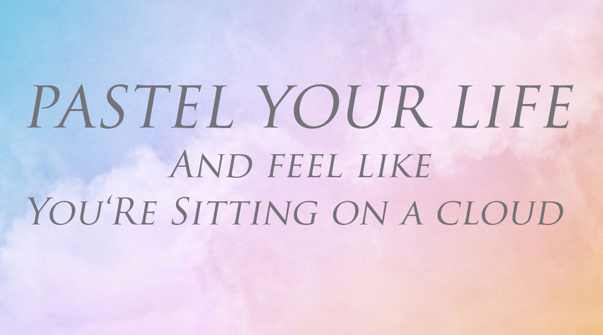
Pastel colors and their effect on your living environment
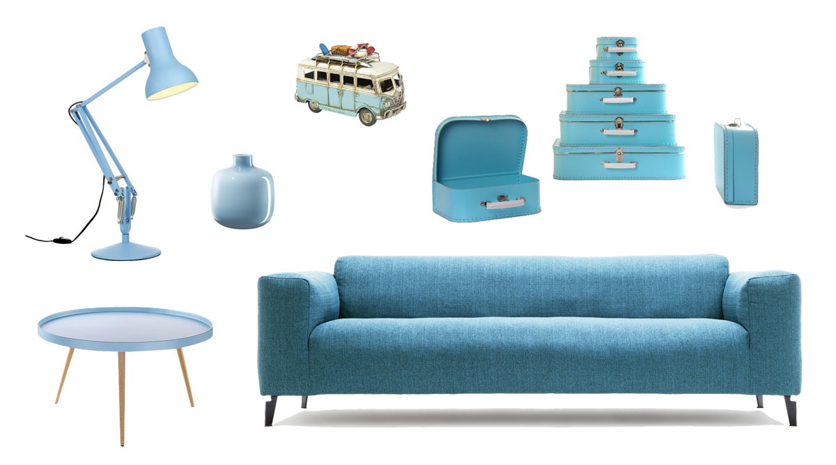
A mix of light grey, mint and light blue makes for a perfect combination with a cool atmospheric effect for your living environment. For a more feminine touch just add a few accessories in pink and light yellow.A mix of all the pastel hues brings spring-like freshness. By adding pastel yellow and pink they will exude cozy warmth. If you are planning to deploy all of the pastel colors, be sure not to cover too large a surface with just one color.
You can achieve an interesting effect by creating different fields of color on the same wall. Create a wall design featuring a harmonious mix of mint, pink, yellow and apricot. With a bit of patience and practice you should be able to paint separate fields of color on a wall by yourself.
A wall design using several different fields of color
1. First you should pull a cord (or string) taut against the wall and tape it in place (top and bottom) with masking tape
2. Step back and look at the wall from a distance to ensure that you like the proportions of the marked fields.
3. Now use a pencil to mark points – at regular intervals - along the cord.4. This gives you a good idea of where to place the masking tape.
5. Now you can remove the cord from the wall.
6. To avoid uneven or frayed edges, you should always apply a thin layer of paint on the masking tape. Do this either with your finger or a thin paintbrush. This seals the transition area from tape to wall and prevents the paint from running underneath the tape.
7. Now proceed to paint the large areas within the fields. Don’t remove the tape until the paint has dried completely.
Pastel tones are much more than just "girlie"
There’s a persistent rumor according to which pastel tones are girlie – and that’s despite the fact that the so-called "ice cream colors" are so versatile! The trick is in the combination! Combined with white and minimalist furniture, pastel-colored rooms are as refreshing as a day by the sea. Sage green, lemon yellow and antique pink are a perfect match and guarantee good cheer. The larger the surface pastel tones are applied to, the more intense the room brightening effect.
One possibility is to keep a room white and then add accessories just in pastel yellow. That will have the effect of bringing clarity, purity and summerly cheer into your living room.
Pursue a purist approach by using only delicate grey nuances and brightening them up with mint green accessories. This combination exudes a natural freshness and lightness.
Additional news blogs on additional colors – pink, pastel yellow, pastel green, pastel blue – and their effect will follow shortly.
Which color lends you wings?
Use the opportunity to get some customized advice. I am looking forward to meeting you and am gladly available for a personal preliminary talk to discuss your plans.
Here you can find an overview of all my offers and packages.
- Detailseite Inhalt (Text) deutsch:
The Delicate Scent of Lilac and Lavender
You can find the modern 3-seater in purple at My-lifestyle-wohnen.de. The "Navona" sofa looks nonchalant and dignified while radiating Gemütlichkeit. Lean back snugly into the high backed cushions; the wide, upholstered armrests offer superior comfort down to the last detail. A lot of thought went into this design: A beautifully-balanced overall appearance, the round tapered feet give this lavish sofa a light and elegant touch. Dimensions: W=230cm D=86cm H=92cm
The purple velvet easy chair ensconced a wooden frame boasts a particularly classy and elegant look thanks to the light-and-shadow color play that can be observed on the dark, luscious velvet. In conjunction with the purple-violet glass chandelier, this easy chair makes a pompous, almost sacral, impression.
The violet roemer wine glasses are a complementary eye-catcher and perfect also as fancy water glasses. As a purist, you might want to use Ikea’s mono-colored glass vases to accessorize your living environment.
The meaning of violet/purple?
Violet - or purple - is a blend of red and blue with a great many nuances covering anything from delicate lilac to bold blackberry, aubergine and crimson. For many centuries, purple was the color of power and the powerful. Bishops of the Catholic Church still wear violet vestments today. Violet is the color of vanity and the unconventional; it is also the color of magic, the spirit, spirituality, inspiration and meditation. But violet is also known as a festive, inspiring, exclusive, purifying, dignified and secretive color.
Violet as a wall color
As a wall color, violet has a calming effect – sometimes even too calming. Violet walls are said to rein in sexual desire and should thus be used economically in bedrooms. The color purple comes with a mythical and dignified aura. Highlight a chic reception room with this color. And when it comes to color-light therapy, violet is known for its purifying effect.
The effect of purple
Feng shui is meant to help our vital energy – or Chi – to flow optimally. The use of colors is an essential component in this process. Purple, however, plays an ambivalent role here. It cannot be definitively assigned to any of the five Chinese elements – it unites the strongest Yin (water – blue) with the strongest Yang (fire – red).
Decorative items in purple or violet hues that have a red cast are associated with the element of fire and bring passion into a room. So too are friendly lilac and lavender nuances. Just a few accessories in this color will suffice to inspire conviviality and so-called "hygge" – a home-like warmth.
Bluish violet can be assigned to the element of water. In terms of feng shui teachings, this is the color of dreamers and opportunities – also count on it to bring lots of good luck!
The color purple’s effect on the body and spirit
When brightened into delicate lilac, purple takes on a lovely lightness and femininity that has a relaxing effect.
In its manifestation as crimson-violet, a certain duality that stimulates contemplation clings to the color purple.
Violet can stir ambivalent sensations that stimulate our creativity in an interesting way.
Just as violet can symbolize the dark side, "the mythical", death and downfall, it also has a positive transformative effect. As a so-called "connection color" between the Earthly and the Transcendental, between the Conscious and the Unconscious, violet can play a strongly meditative and balancing role that helps bring the Body and Spirit into harmony.
Violet boosts one’s concentration and intellectuality.
Bluish violet promotes healthy sleep and can help alleviate headaches.
Positive associations with the violet/purple
The exceptional, the original, the fashionable, magic and imagination The meaning of violet/purple in religion, history, art and culture Purple is the color of individuality and self-confidence. It symbolizes feminism and women’s love, creativity and diplomacy. But purple is also the color of melancholy, healing – and of death. It is the color of spirituality but also the color of sin. The power and meaning of the color purple is very diverse and, in part, also rather contradictory.
In the Christian Church, violet is the color of contemplation and spirituality. Church dignitaries such as Catholic bishops often wear purple vestments and purple is the liturgical color during Lent.
In the Women’s Liberation Movement, this color has stood for emancipation and women’s rights since the end of the 19th century. It came into fashion in a big way during the 1920s and also in the 70s when purple was equated with feminism. For women’s libbers of that era, purple overalls were the "it-piece" that no one could do without.
In Alice Walker‘s autobiographical novel The Color Purple (and in the eponymously named film), fields of violets are a source of strength for the abused protagonist. And they also represent a new awakening, self-liberation and, in some ways, also women’s love.
In late antiquity, purple garments were long considered an expression of power and wealth since the pigments needed for dying fabrics had to be extracted from thousands of sea snails (Muricidae family) in an elaborate and very time-consuming process. Later it became possible to create a natural purple dye using the parasite cochineal.
During the Nazi era, regime opponents considered dangerous because of their confession (Jehova Witnesses, for example) were forced to mark their outerwear with a purple angle. The annual Purple Day which takes place across the globe on every 26th day of March is dedicated to raising awareness about epilepsy.
Which color enhances your concentration and lets your magic radiate?
Use the opportunity to get some customized advice. I am looking forward to meeting you and am gladly available for a personal preliminary talk to discuss your plans. Read more about the effect of colors and let me inspire you with my blog entries on color consulting and interior design consulting!
Here you can find an overview of all my offers and packages.

- Detailseite Inhalt (Text) deutsch:
Red - Bring vibrancy and warmth to your living environment
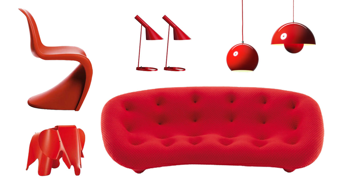
The red "Ploum" sofa designed by Ronan and Erwan Bouroullec for Ligne Roset, boasts supremely soft seating comfort. In addition to this one-of-a-kind comfort, the extraordinary design in combination with the sofa’s stitched covering makes for a real eye-catcher. The Ploum line is available in various models. The sofa shown is the family-friendly XXL version.
The red chair "Panton," conceived by Verner Panton and produced in collaboration with Vitra, is a furniture icon. Verner Panton designed it in 1960 and, together with Vitra, evolved it to series-production readiness in 1967. It was the first all-plastic chair to be cast in one piece. Since its market introduction, it has passed through several production phases. In fact, only since 1999 has the Panton been manufactured in accordance with the designer’s underlying idea and concept, namely in durable, dyed-through polypropylene with a matte finish.
The red "Eames Elephant", initially developed using laminated wood by Charles and Ray Eames in 1945, is available in plastic in several colors. Use it as a toy or as a decorative object – and not just in your child’s room.
The red "AJ" table lamp, designed by Arne Jacobsen for Louis Poulsen, is available in 8 different colors.
The ceiling lamp "Flowerpot VP1 and VP2", designed by Verner Panton, is a 60s style icon that is available in various models and colors.Red as a wall color
Red is the color of activity, dynamism, temperament and warmth. A red wall shows off your entré, living room, dining room or bedroom to best effect. But when it comes to bold red shades, less is more. An entire room in red is too overpowering. One wall in red – a so-called "accent wall" – is the look you want. A wall in claret exudes coziness. It is appetite-enhancing and cozy and gives the room a relaxed aura. Red used as a wall color augurs warmth and adds a touch of the exotic. It looks exceedingly natural, especially when combined with wood or rattan furniture.
Red accessories as vibrant color accents
Red accessories send out a clear signal and grab everyone’s attention. Be careful not to use too much red since it can be overwhelming and off-putting when overused. You can’t go wrong with combinations of any red nuance with any pink nuance: Artfully arranged on a shelf, vases and flacons, bowls and bottles will compose a beautiful picture. Arising from the same color family, all red hues will harmonize nicely. You can add a few other splashes of color, such as yellow, green or blue, to break up the red a bit. Homogenous rooms designed with a white or grey color scheme, for example, should feature only a very few scattered red accessories. Another option is to put the focus on a special piece of furniture.
Red gets your blood boiling – and that’s something to look forward to!
It increases our energy level, our fortitude: That’s because red stimulates all our body’s processes. It stimulates our metabolism and exerts a strong influence on our vegetative nervous system. Warm red also has an invigorating, positively-reinforcing effect on an emotional level. It enhances sensuality, conscious experiencing, sensation and the expression of passion. On a mental level, the energy that the color red conveys reinforces our will, determination and perseverance.
People associate red with love, blood and suffering but also with passion and eroticism. When it comes to magic, red is used in rituals aimed at bringing about health, fertility, love, courage and strength. But red also stands for emotionality, aggression and willpower. Red is invigorating, activating, appetite-enhancing and generally stimulating. Red symbolizes vitality, excitement, strength and vigor. Red can make one aggressive and reinforces interests. Red is passion, love and courage. Orange is inspiring and stimulating.- Activity and dynamic
- Strength and vibrancy
- Happiness and joie de vivre
- Energie, courage and activity
- Love and sexuality
- Eroticism and seduction
- Fire and heat
- Temperament and warmth
Which color activates your sense of vibrancy and vitality?
Use this opportunity to get some customized advice. I am looking forward to meeting you and am gladly available for a personal preliminary talk to discuss your plans.
Here you can find an overview of all my offers and packages.
- Detailseite Inhalt (Text) deutsch:
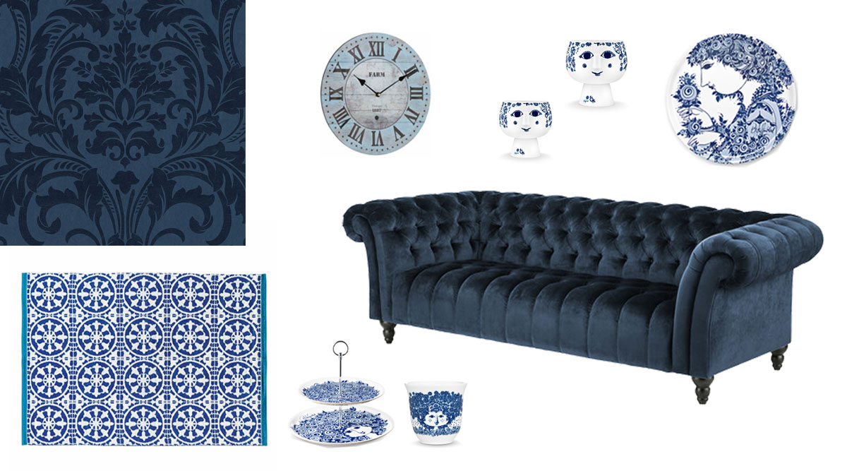
Blue - A Time for Relaxation
Inner peace and serenity will let you forget your hectic daily routine and restore a pleasant calm to your life. The dark blue of the velvet Chesterfield sofa "Gladis" (two-seater) from WestwingNow really come to its own thanks to exquisite stitching.
The design of classic blue and white porcelain has an illustrious history that goes back far in time. It is variously known to be used as wall décor, as floor tiles or as tableware, where it guarantees a festive table. Presented here are a few accessories for your own festive table: Bjoern Wiinblad Rosamunde‘s decorative plates, what-nots by Bjoern Wiinblad Rosalinde and an insulated cup by Bjoern Wiinblad Felicia. Also shown is the very practical SANTORINI (Cyclades Islands) outdoor blue and white rug (140 x 200 cm) in the classic floor tile style. The Retrostore wall clock by Antique HOME Vintage in a natural wood look.Velvet-soft covering fabric in deep blue
Blue velvet is very classy, both as covering material for furniture or used as a curtain. Wallpaper of dark blue fleece, as shown here in a floral pattern, and dark blue silk tapestry it not only attention-grabbing but also lifts the mood. With the appropriate lighting, it will spread a very mystical room atmosphere.
Blue as a wall color
Blue is associated with the color of the sky, the sea and the blue night. Blue shades range from light blue and delicate baby blue to darker and bolder blue shades. Each shade of blue produces a very different effect that depends on a room’s light conditions. Basically, you can say that light blue shades make rooms appear bigger, lighter and cooler. Dark blue shades, on the other hand, make a room look smaller and create a cozy atmosphere. Depending on the color’s intensity, it can also generate a mystical room atmosphere.
Which living spaces are appropriate for blue?
Blue bedroom
Being that the color blue has a very calming effect, blue is perfectly suited for the bedroom – all color nuances work nicely here.Blue bathroom
With a blue bathroom, there’s always a fresh ocean breeze that’s blowing through. The lighter the shade of blue, the fresher the breeze. The ocean picture hanging above the bathtub lets you plunge right into the sea and does its part in creating this restorative oasis of wellness.Blue kitchen
A blue kitchen always looks cleaner and more orderly – but the overall effect is also cool. For this reason blue is popular as a kitchen color in hot climates.Treatment rooms in a surgery are also wonderfully suited for the color blue, but here too you should opt for lighter shades of blue.
What can be combined with blue?
The color blue can be combined with any material and with any color. Depending upon the desired effect, you could accentuate blue’s cool statement by combining it with white. This is done in many Mediterranean countries as well as in the North Sea and Baltic Sea regions. The dark blue shades are particularly vibrantwhen offset by white door frames or skirting boards. You can create a cozy atmosphere when blue shades are complemented with wood. All basic colors, in other words, yellow, red and green – pastel shades and deeper shades alike – combine with blue wonderfully. Accessories in blue also have a special effect: Blue bedding reduces stress, creates calm and provides for restful sleep.
Positive Associations
- Sympathy and harmony
- Friendliness and friendship
- Remoteness, vastness, endlessness and quiet
- Faithfulness, desire and relaxation
- Intelligence, science, exactitude and punctuality
- Concentration, sportiness, performance and courage
- Eternity, truth, clarity and purity
Which color helps calm set in and reduces tension?
Use the opportunity to get some customized advice. I am looking forward to meeting you and am gladly available for a personal preliminary talk to discuss your plans.
Here you can find an overview of all my offers and packages.
- Detailseite Inhalt (Text) deutsch:
Green - Feels like Sitting in the Nature
Green is calming and invigorating at the same time, depending upon the shade selected. The color green also stands for the feminine Yin, the passive, receptive principle.
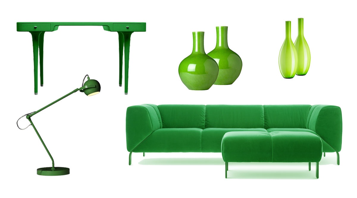
The green sofa 323 designed by Anita Schmidt for Rolf Benz was awarded the environmental "Blue Angel" certificate. Rolf Benz 323 is the re-interpretation of the classic sofa design Rolf Benz 322. It incorporates the defining feature of its predecessor, namely meticulously-mitered cushions with the foot positioned in between. Its distinctive form has been merged with supremely soft and casual sitting comfort. The softly cushioned couch with its comfortable sides beckons you to relax lavishly. Discover a new classic design! This furniture line is available in the following sofa widths: 212 cm, 233 cm and 254 cm and seat heights: 42 cm or 44 cm. Seat depth: 59 cm or 67 cm
The green "Riga" desk was designed by Marc Newsom for Cappellini. It features rounded corners, cheerful colors and a graceful design: With a length of 140 cm and a depth of 70 cm, designer Marc Newson’s "Riga" is an ideal candidate for small rooms. The wooden desk has two drawers with knobs made of natural anodized aluminum; the feet were fashioned of the same metal. Matt-lacquered, it is available in green, white and turquoise.
The green desk lamp can be combined with a wooden desk as readily as with a colorfully-lacquered desk. The green floor and table vases turn every bouquet into a picture-perfect field of spring flowers.
What effect does green have?
Green has a calming effect. It creates a good balance, calm, safety and security.
Green feeds the soul with good vibes and awakens the desire to discover new things.
Green is considered the source of creativity.
A green room is restful and invigorating and exerts a regenerating influence on the organism. Green can neither be termed a warm nor a cold color.
Shades of green are often experienced as equalizers between two poles; they are friendly and relaxing.
Tinting it with blue makes green much colder and more aggressive.
Green is ideally suited for interiors that should radiate peace and be mentally and artistically stimulating alike.
Fresh, light green – whether as a color or a plant – should never be in short supply.
Green as a wall color feels like being enclosure by a hedge
Green as a ceiling color nurtures and shields.Green as a wall color
Green represents hope, calm, security, inspiration, freshness, nature and vitality. In Asia, green is associated with hope and joie de vivre. One associates green primarily with genuineness and freshness. Green rooms can have the effect of calming, restoring a sense of balance and even muting noise. That is why green commends itself especially for bedrooms and designated relaxation zones. Depending on the nuance, green is vitalizing and stimulating – or calming: Green shades tinged with blue are calmer; those tinged with yellow are more stimulating. Dark shades of green are usually more appropriate for static or supporting components than light ones. Light shades of green appear more delicate and light. Combined with blue shades, peaceful room designs emerge. Make them appear even more natural by using wood furniture. Accents in red are appropriate for high-contrast, very lively room designs.
From olive green to apple green to mint green, all these shades of color are found in nature. Through its subdued hue, olive green as a wall color generates a cozy and warm Mediterranean atmosphere. Combined with light furniture or rattan you invite Tuscany into your new home. To lend your rooms an extra special freshness, bold apple green does the trick. This color is perfect for the kitchen together with white-lacquered kitchen furniture. Every new day will begin with a healthy and invigorating breakfast.
Sage green is suited for every living space. It can have a playful, relaxed, sophisticated or funky effect, depending on the colors you combine it with. This versatility makes sage green the perfect choice for traditionally-furnished and modern rooms. Sage green walls offer a beautiful backdrop for high-contrast furniture and accessories.
Are you looking for a fresh color? Mint green is a beautiful alternative to ordinary, neutral colors. This color brings brightness into the room and offers a relaxed, subdued vibe. Mint green walls are a wonderful foil for pink, white and yellow furniture and accessories.
Which section of your living quarters is best suited for green?
Since nuances of green are so varied, their effect is equally varied. Green is suitable for any living space, whether it be the hallway, kitchen, living room, bedroom, study or nursery. You can even generate a green wave in your home that offers everything from invigorating to calming.
What can green be combined with?
The color green can be combined with any material or color. Depending on the desire mood, you can bolster green’s expressiveness by combining it with white. The olive green shades have an especially cozy effect. Together with wood, they create a warm, Mediterranean atmosphere in your living quarters. All basic colors, including yellow, red and blue, make wonderful combinations with green.
The meaning of green in culture and religion
Green stands for life, green stands for growth, green returns again and again. Age-old wisdom tells us that our survival is assured when fresh green sprouts up from the soil. Green is the symbol of our hope for life and survival. Different regions, races, cultures and religions all around the world come together in this hope. Apparently the prophet Mohammed once said that beholding green is tantamount to a divine service. For this reason, green is the Islamic cultic color. In all Islamic countries, green symbolizes the Muslim religion and this color is used exclusively within a religious context. Survival in the endless stretches of desert being assured only if one can reach a green oasis in time, green is also found on the flags of most desert nations. In our climes, it is customary in winter to bring an evergreen Christmas tree into our living room as a symbol of hope. This was already done in the pre-Christian pagan times. In ancient Palestine, brides wore green wedding dresses in the hope that this color would grant them a happy live and fertility. Green represents Catholicism on the green island of Ireland.
Positive associations with green
- Nature, naturalness
- Life, liveliness
- The spring, freshness
- Hope and confidence
- Green meadows, fields, fertility and harvest
- Youth
Which color calms and enlivens you at the same time?
Use this opportunity to get some customized advice. I am looking forward to meeting you and am gladly available for a personal preliminary talk to discuss your plans.
Here you can find an overview of all my offers and packages.
- Detailseite Inhalt (Text) deutsch:
Springtime into Your Home
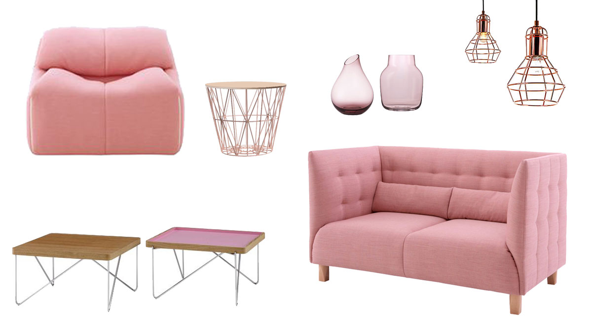
The pink MCD sofa was designed by Marie Christine Dorner for Ligne Roset. This furniture line combines classic optics with a soft and comfortable core. The covering is smooth and clear-cut, with seams that were stitched into squares. The fine stitch quilting on the arm and back rests of the inner cushioning takes up the pattern of the outer body, giving the sofa its bulbous form. The subtle combination of coverings marks the boundary between the two sofa sections; a structured exterior and a soft interior. A versatile piece of furniture with compact dimensions and a straightforward classic design, it is also a very comfortable retreat. The upholstered furniture series MCD is available as three- and two-seater versions and encompasses an armchair with a sitting height of 41 cm. The foot rests are available in light or dark wood versions. The MCD series would also be a great fit for the reception area of a company or hotel lobby.
With its pink "Plumy" armchair, designed by Annie Hiéronimus, Ligne Roset has re-adapted one of its iconic bestsellers in 2016. This model epitomizes extraordinary sitting comfort and highlights Ligne Roset’s savoir faire in the area of all-foam seat designs. Thanks to the new generation of foam material now available, it is even more comfortable and durable than ever; an unconventional and uncomplicated contemporary model. Together with the stool, the fold-out seat cushion enables very relaxed sitting – or even reclining. The covering was designed in a deliberately casual way to show creasing with wear. It is available as an all-fabric or all-leather version or, alternately, in a version made with the lining material of the seat and back cushions. The "Plumy" series is available as a three-seater, two-seater, armchair or stool design. The larger three-seater model has a width of only 237 cm and is thus perfect for small living rooms.
The pink "Teatime" couch table designed by Designbüro Müller & Wulff for Ligne Roset, invites the look of the 50s into your living room. It combines a sawn wooden oak panel with a delicate chrome frame. The panel can be flipped over to reveal a silk-matt pink finish; this adds a lovely, sophisticated touch to the "Teatime" couch table. Also available with a slate grey inner surface. Measurements: 57.5 cm x 64 cm, height 35 cm.
With the "Basket" side table, Danish design manufacturer Ferm Living has designed a home accessory that is anything but ordinary despite its understated graphic design. The wide selection of colors and sizes available for this duo allow it to fit in with just about any new trend for interiors. These two get along with each other splendidly: The metal basket and wooden panel embody functionality and harmony. Together, they are so timeless and iconic that they should be a part of everyone’s interior décor. Dimensions: Height 35 cm, Ø: 40 cm.
The copper ceiling light "Vintage" is available in various sizes. The pink "Silent" glass vase (bulbous) by Muuto and the drop-formed pink "Sannolik" vase by Ikea, height 17 cm.
The meaning of the color pink?
Just as there are numerous shades of pink, there are also numerous meanings and forces that are associated with this color. We see things through rose-colored lenses; we are "in the pink" when we feel fit and healthy and "tickled pink" when we are extremely happy or amused. And whenever we want to depict something positively, we do so by "painting a rosy picture".
How does pink affect us?
Pink gems give us strength for the challenges we face. We associate the color pinkwith romance and love. Just like all other pastel shades, pink represents lightness and freshness. It heals, warms, comforts and can lift our spirits. When you feel tired or down, a pink-colored bouquet will exhilarate you. Not only will you be delighted by the sight of a wonderful, pink-colored lily blossom, its fragrance will mesmerize you as well. One large lily will suffice to fill an entire room with its aroma. When spring arrives, wonderful cherry blossoms or, for a short time, magnolia boughs, are both attention-grabbing as well as create a wonderful mood within your four walls.
The effect of pink according to feng shui
Feng shui is a special way of decorating your home. Properly placed furniture in a room allows chi (life force) to flow properly and thereby enhance your well-being. According to the teachings of feng shui, there are five important elements: Wood, fire, earth, metal and water. The color pink belongs to the element of fire and radiates friendliness and warmth. If you linger in a room that has been painted in shades of pink you become even-tempered and feel like you are in good hands. If you entered the house in a bad mood, you certainly won’t leave in one. Pink tends to lift one’s spirits.
Pink as a wall color
You can attain a wonderful indoor ambience using pink. It helps us to reach inner peace and serenity. Pink is especially suited for large wall surfaces. Depending on the nuance used, it radiates a very relaxed or refreshing vibe into your living areas. Dusky pink tends to give your living quarters more of a dignified, warming atmosphere while white pink enchants your rooms with more of a child-like freshness.
Which part of your living quarters is best suited for pink?
Because pink nuances are so varied – and thus also their effects – the color pink is suitable for every living area. Pink is perfect for your bedroom or nursery because pink provides for restful sleep here. Apart from that, hallways, kitchens or even living rooms are wonderfully suited for this color. Keep in mind, however, that men don’t necessarily like pink. You might be able to win over your partner for this color if you combine it with black.
What can pink be combined with?
The color pink can be combined with any material and any color. You can underscore pink’s expression of freshness by combining it with white. The dusky pink shades exude an especially cozy effect and create a warm room atmosphere when combined with wood. The combination with any pastel shade, whether light blue, pink, pastel green or pastel yellow is wonderfully invigorating – not only for your nursery.
The meaning of pink in culture and religion
- In the Orient, pink is the color of manliness while blue is the color for femininity.
- Pink has no application in politics. Red, however, symbolizes a socialist or communist orientation. In accordance with this line of reasoning, pink (if you imagine it as a lightened shade of red) is the color of voters who have socialist or communist leanings.
- Pink is also represented in art; it is considered the color of Rococo.
- In liturgy pink (if you imagine it as lightened purple) represents a sign of anticipation.
- In society pink signals affiliation to the gay-lesbian scene.
- In dream interpretation the color pink stands for personal desires and needs as well as for secret desires.
Positive associations with pink
- Love and compassion
- Child-like and maidenly, babies
- Sense of safety and nest warmth
- The coming of spring and refreshing lightness
- Inner peace and equilibrium
- The pure, the sweet and unconditional love
What color gives you a sense of love and compassion?
Use this opportunity to get some customized advice. I am looking forward to meeting you and am gladly available for a personal preliminary talk to discuss your plans.
Here you can find an overview of all my offers and packages.
- Detailseite Inhalt (Text) deutsch:
Light Yellow sounds like Lemon and Vanilla ice cream
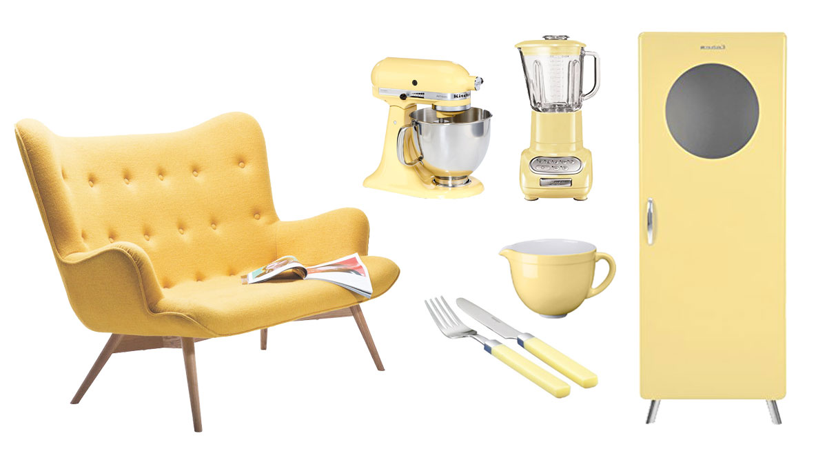
The pastel yellow 2-seat sofa "Angels Wings Yellow" by Kare Germany invites you to sit back and while away the time. A supremely charming 2-seater in sunny yellow, with a delicately-shaped and curved seat shell, it couldn’t possibly be more comfortable! Elegant Chesterfield upholstery whose covering is fashioned of premium wool rests on a solid ash framework with a lacquer finish. Dimensions: H 93cm, W132cm, D 99cm, SH 37cm.
KitchenAid manufactures the perfect pastel yellow products: For example, the familiar Artisan KitchenAid KSM150PSEMY in pastel yellow. A pastel yellow blender is also available from the Artisan KitchenAid 5KSB5553EMY series in pastel-yellow. The KitchenAid 4.7 liter ceramic bowl, Artisan 5KSMCB5 series in pastel-yellow.
The 24-piece MIRA flatware, color: vanilla-yellow in 18/0 stainless steel comes with a round cutlery tray, price ca. 85€. All these sunny products lift your mood and spirits in the kitchen. Take advantage of the power of colors.
This also applies to the pastel yellow kitchen cabinet "Tenzo" (4901-075 Cobra designer) featuring a partial glass front, wood, dimensions D 43cm, W 56cm x H 149cm by Tenzo. The vanilla-yellow display case in a classic design is not only eye-catching; it also offers plenty of storage space for your kitchen.
Pastel yellow as a wall color
Pastel yellow, or vanilla-yellow, is associated with sweetness and softness. This touch of yellow is a uniquely creamy and classy shade for large surfaces; it accentuates the room as a whole and lends it spaciousness. Use the color by itself or in combination with other pastel hues for a sunny radiance that gives your room high spirits, liveliness and the sensual lightness of being.
Which rooms are well suited for pastel yellow?
You can use yellow – which is bound to put you in a good mood – in any room, whether it’s a bedroom, living room, nursery, guest room, kitchen, hallway or office. Pastel yellow is simply uplifting.
What can pastel yellow be combined with?
All of the pastel shades can be combined with one another. Consider first, however, whether you prefer cooler or warmer hues because there are so many possibilities of combining the pastel tones. If you prefer a minimalist look, I would recommend light grey combined with mint. Should you prefer warmer tones, marry pastel yellow with pink.
A colorful mix of pastel yellow, pastel green, pastel blue and pink evokes the colorful, delicate atmosphere of a sweets shop right in your own four walls; spirits are bound to soar! This color combination is loved especially by children since pastel colors bestow a sense of security to their souls.
Positive associations with pastel yellow
- Joyousness and summerly freshness
- Security and warmth
- Sweetness and softness
- Wisdom and patience
- Control and tolerance
- Active Yang color
Which color lifts your spirits?
Since the possibilities of combining pastel tones is endless, I would be happy to make myself available to you for a personal consultation.
Here you can find an overview of all my offers and packages.
- Detailseite Inhalt (Text) deutsch:
Sky Blue - Feels like Flying
The light blue "Freistil 186" sofa is a 4-seater by Rolf Benz. This renowned Swabian upholstery expert has launched a new, authentic line of seating furniture that reflects the urban attitude towards life in the 21st century. Despite our hyper-mobile, technology-driven daily routine, privacy is once again regaining importance. The upholstered furniture series is beholden to the usual high quality standard that customers have come to expect from Rolf Benz. Every piece of furniture is crafted in Germany – at a comparatively low price. The inviting and relaxing one-piece sofa is supremely comfortable yet highly presentable. The three and four-seat versions feature a wooden frame and multilayered upholstering made of metal springs and cold foam. The back and armrests are upholstered using foam fibers. Pleasantly-textured coverings tailored of hard-wearing synthetic fiber adds a finishing touch (seat height 41 cm, seat depth 62 cm). Another fine detail is the set of gleaming black-lacquered diagonal feet that support the couch. Bold-colored and decorative rectangular pillows – an optional detail – in a 2:1 format give the Rolf Benz Freistil 186 sofa a splash of color. Dimensions: 223cm x 92cm, H 70cm.
The light blue couch table "Flicka I" by Morteens comes in a diameter of 90 cm and height of 45cm; the MDF tabletop boasts a light blue matt finish and legs of solid beech wood.
The light blue "Anglepoise Type 75" mini table / desk lamp 283C, light blue 30830 by Anglepoise is suitable for any desk. Light wood – or even a white desk – would make a perfect match.The light blue children’s suitcases by Lütt & Fien are available in several different sizes. Use the suitcase as decoration or as storage space for sewing tools and supplies.
The light blue, nostalgic bus miniature, ca. 26cm, by Deko Wörner is a shabby chic accessory that can loosen up a straightforward interior design a bit. The bulbous little vase of light blue glass is available from moebelfans.The effect of light blue
Light blue is associated with the following characteristics: Clear, analytical, cerebral-oriented, athletic, fresh, subtle, sensible, tender and delicate. Word associations: Baby blue, light blue, ice blue, pastel blue, ocean blue, turquoise-blue, water blue, sky blue.
What can light blue be combined with?
Combining pastel colors (pastel yellow, airy blue, mint green and delicate pink).
In the color circle, pastel colors are characterized by a high proportion of white. Thanks to their low level of saturation, pastel colors look friendly and relaxed. All pastel colors can easily be combined with one another. Always introduce some cool accents into your pastel color world to avoid potential monotony!
A mix of all pastel tones combined with a bold bouquet of yellow tulips on a tabletop is perfection incarnate. Even if it’s snowing outside, you’ll think springs has already arrived.A colorful mix of pastel yellow, pastel green, pastel blue and pink evokes the colorful, delicate atmosphere of a sweets shop right in your own four walls; spirits will soar quickly! This color combination is loved especially by children since pastel colors lend their soul a sense of security.
Prior to launching your plans, consider whether you prefer cooler or warmer hues because there are so many possibilities of combining the pastel tones. If you prefer a more minimalist look, I would recommend light grey combined with mint. Light wood is also a great foil for any pastel hue. It gives the somewhat cooler pastel tones a nice earthy character.
Since there are sheer endless combination possibilities for pastel tones, you stand to benefit from a personal consultation with me.
Living quarters in pastel blue or light blue
Pastel blue works nicely throughout your living quarters – be it living rooms, children’s bedrooms, guestrooms, kitchens, hallways or offices. Light blue brings heaven on earth.
Positive associations with pastel blue or light blue
- Freshness and lightness
- Coolness and heavenly clarity
- Sympathy and harmony
- Freedom and foresight
- A friendly disposition
- A desire to be on cloud nine
Which color guides you to personal freedom and clarity?
Use this opportunity to get some customized advice. I am looking forward to meeting you and am gladly available for a personal preliminary talk to discuss your plans.
Here you can find an overview of all my offers and packages.
- Detailseite Inhalt (Text) deutsch:
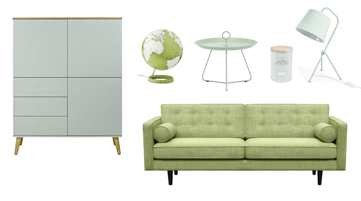
Pastel green - Natural lightness
The pastel green sofa "Ethnicraft N101" is by Twenga. The course, mottled covering material can be very nicely combined with white to underscore the naturalness of mint green. The design is reminiscent of Mies van der Rohe. Classic design radiates in new colors.
The pastel green high board by "Tenzo" was designed by Måns Broman. It features three doors, three drawers, three shelves and has a "push-to-open" function. Material: matt lacquered chipboard panel, front panel made of medium-density fiberboard, matt lacquered; top panel, oak veneer; base frame, solid oak. Dimensions: H=137cm, W=109cm, D=43cm.
The pastel green globe by L & C-Pastell is available in three additional colors as well. Excellent Swedish quality and design by Klaus Jensen & Henrik Holbaek, Tools Design. Available in English only. Every home should have a desktop globe – both for decorative and for educational purposes. The globe is the only true model of our planet. How else can one see the position and the actual distances between the continents, the topographical diversity of the various countries and the tremendous size of our oceans? Off to discover thrilling new worlds! Dimensions: Diameter 30 cm height 37 cm. Base and axis made of polycarbonate.
The grey-green couch table "Eyelet" medium / Ø=60cm x H=43.5 cm is manufactured by Houe. This uncomplicated little table is readily transportable. It can be carried back and forth between your garden and living room just as the fancy takes you! Available in several trendy colors, the Eyelet table is crafted from lacquered metal and characterized by its three legs and pipe-shaped table frame that reaches through the table top. The handle that extends from the table frame and protrudes from the middle of the table not only gives the table its sturdiness but also provides perfect balance for transport. A one-of-a-kind design that lends "Eyelet" its unusual originality and functionality! The highly robust couch table is the perfect companion for relaxed al fresco moments. It even comes equipped with a drainage hole to prevent rain water from pooling on the table. Suitable for use outdoors – comes with drainage hole for rain water – centered handle on the table top guarantees effortless transport, price ca. 159€. This product is also available in Ø=45cm and Ø=80cm and 6 different colors, depending on the size.
The mint green metal tin "Home Kitchen" by Maisons Du Monde is also available in light grey H=16cm. Ideal for storing little utensils that might otherwise clutter up your kitchen, price ca. 9€. The mint green vintage lamp by Maisons Du Monde is made of metal, H=45cm.
Pastel green or mint as a wall color
Pastel green or mint green connotes natural lightness, levity and freshness. A touch of mint has a uniquely fresh effect and is intuitively reminiscent of spearmint.
Which rooms are suitable for pastel green or mint?
Bedrooms, living rooms, the nursery, guest rooms, hallways or offices – pastel greenis suitable for any room. The color mint welcomes fresh, spring days into your home.
What can be combined with pastel green?
All pastel tones work well with one another. In the run-up, however, you should decide whether you prefer a cooler or warmer atmosphere since there are so many ways of mixing pastel tones. If you like things a bit more low-key I would recommend you combine mint with a light grey. All pastel tones are also a good match with light wood, which gives even rather cool pastel tones an earthy character.
A colorful mix of pastel yellow, pastel green, pastel blue and pink evokes candy jars at a sweet shop and automatically raises spirits.
Especially children love this color combination because pastel colors also give our souls a sense of security.As there are a sheer endless number of combination possibilities for pastel hues, I would be happy to consult with you personally.
Positive associations with pastel green
- Natural freshness and levity
- Cool naturalness and clarity
- Hope and harmony
- Cooling and neutrality
- A time of magic and elves
- Spearmint and deep, clear breath
Which color freshens you up and revives you?
Use the opportunity to get some customized advice. I am looking forward to meeting you and am gladly available for a personal preliminary talk to discuss your plans.
Here you can find an overview of all my offers and packages.
- Detailseite Inhalt (Text) deutsch:
Orange Flower Power
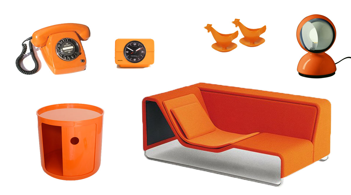
This photo very consciously shows 70s design and conveys a bit of nostalgia. The orange lounge-bed "island Divani" by Paola Lenti, which actually didn’t appear on the market until 2003, beautifully takes up the style of the 1970s.
This interesting piece of outdoor furniture can be combined in a great many ways with additional seating elements. The rough weave covering material and additional seat padding in a delicate outdoor fabric are a cool material mix. This minimalist design is timeless and universally deployable – both indoors and outdoors.The orange Artemide® bedside light "Eclisse", the orange "Krups" alarm clock, the old dial telephone (which harkens back to West Germany of the 1970s) and the old East German-made egg cups in bold orange beautifully mirror the 70s. The design of Kartell’s orange-colored bar has stood the test of time and is available in several different colors.
What’s the meaning of orange?
Orange represents vibrant strength and activity. This color’s warmth invariable lifts spirits: Orange is the color of joy and conviviality. It is associated with a sense of security, comfort and emotional warmth. Its positive influence on pessimism, depression and a lack of drive is simply astonishing. Orange loosens up and activates anyone who is stuck in their grey day-by-day routine. Thanks to its very stimulating effect, orange is a popular choice in color therapy where it is used to reinforce the immune system and to activate the body’s own defenses.
Like red and yellow, orange is among the warm colors. It symbolizes optimism and joie de vivre and has an uplifting, positive overall effect on health. Orange prompts us to live for the moment in the here and now; it can break through blockages and gets things back into flow. On a spiritual level, orange promotes trust and a zest for life. It unleashes the senses; open-mindedness and a sense of togetherness sets in. Orange helps to embrace and live out one’s need for indulgence and sensuality. Orange is the color of children and all those who feel youthful and energetic. Light orange is equated with joy and creativity.
In Buddhism across Asia, orange is the color of the highest level of human enlightenment and Buddhist monks wear orange robes. By contrast, it is nowhere to be found in Medieval European paintings; neither as a symbolic color nor as a color for garments.
The color orange is held extraordinarily dear especially in India because of its resemblance to the native population’s skin color. While white is idealized by white-skinned cultures (even though their skin color is far from bright white), the people of India idealize saffron-yellow skin. In this context one should note, however, that the typical Indian orange nuances are what we would label as yellow tones in western cultures.
The effect of orange on the body and soul
Orange fills people with joy and optimism; it refreshes the soul and boosts creativity. Orange exudes warmth and spurs one onto peak performances. As part of color therapy, orange is used to treat fear, restlessness and anxiety since it functions as a natural mood enhancer. Orange is also known to have a positive effect on depression, lack of appetite, constipation and kidney disease.
Orange brings cheerfulness into your home
•Orange generates a cheerful, relaxed atmosphere
•Orange is stimulating; as a friendly "social" color, it exudes warmth and comfort
•Orange stimulates an appetite and promotes conviviality
•When orange is tinged with white it loses its radiance
•It is an ideal color for your kitchen or dining room
•Orange is perfect for North-facing rooms with too little natural light or sun
•Orange used as a wall color gives warmth to a roomUsing orange for good feeling
Orange in the dining area. If you believe in the principles underlying feng shui, you surely won’t be averse to orange-colored walls.
That’s because orange is associated with joie de vivre and vitality. Orange lets dark and small rooms radiate; it is conducive to a relaxed atmosphere.
In rooms where guests are welcomed (living and dining rooms), orange fosters a convivial spirit and keeps the conversation flowing.
In bedrooms and guest rooms, too much color can, however, trigger sleep disturbances. Here, less is more.
Positive associations with the color orange
Fun, pleasure, sociability, indulgence, energy, activity, warmth, trendy and change.
The meaning of orange in culture and religion
In Ireland, orange represents Protestantism.
The Dalai Lama and other enlightened Buddhists drape themselves in orange. In Buddhism, orange is associated with the highest level of human enlightenment.
Official dignitaries of China also wear orange.
In The Netherlands, orange is considered the color of freedom.
Orange is the color of the Caribbean, Samba and open, joyous encounters.Which color activates your joie de vivre and power?
Use this opportunity to get some customized advice. I am looking forward to meeting you and am gladly available for a personal preliminary talk to discuss your plans.
Here you can find an overview of all my offers and packages.
- Detailseite Inhalt (Text) deutsch:
Elegant or powerful – anything is possible
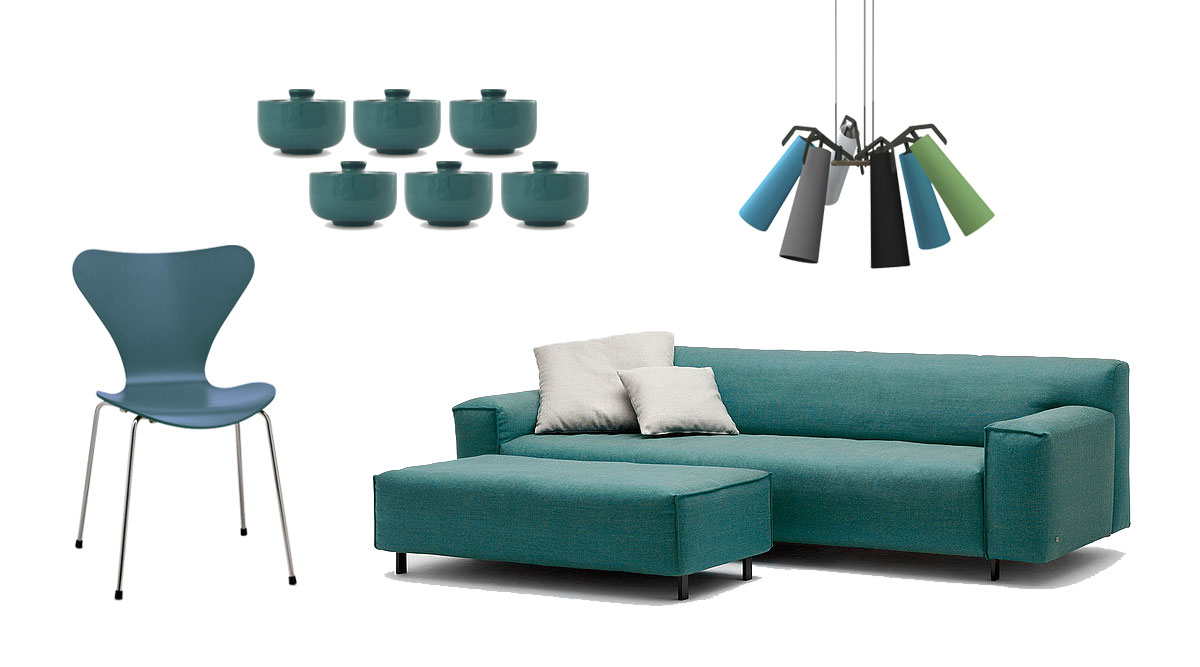
Teal conjures up a touch of elegance in your living environment. A sense of well-being comes easy in the presence of the teal-colored sofa "Grata" by Rolf Benz. Its upholstery boasts lounge-like softness for unparalleled comfort, and it lets a sense of calm and relaxation set in. While it’s very casual, it puts real personality on display. The sofa’s gracefully-curved sitting surface and piping that was executed with consummate skill will reap admiring glances. This furniture line is available in three seat widths, two seat heights, two side-section heights and comes with sofa foot options in shiny chrome or black varnish.
The teal chair is something of an eternal classic. "Serie 7 Stuhl" was developed in 1955 by designers Arne Jacobsen and Fritz Hansen, Teal-dyed ash wood, chrome-plated, 46.5 cm.
The round ceiling lamps "La Grande Enorme" with 6 lights each were created by Reinhard Dienes for Anthologie Quartett.Teal as a wall color
Be it teal green or teal blue, this trendy color always has a classy and intense effect. Teal is wonderful in combination with grey, yellow, red, green, white or black. Brass or copper accessories and furniture look fabulous silhouetted against a teal wall because the golden shimmer offers a warm contrast to the cool wall color. It gives rooms a delicate touch of elegance.
Bold shades of teal have a soothing and pleasant effect that is ideally suited for bedrooms. An accent wall in teal – the wall behind your bed, for example – will prevent the room from looking too dark. Teal green or teal blue – these bold and intense trendy hues are perfect in combination with grey, yellow, white or green.
As a wall color, teal is not just extraordinary; it can even create a cozy atmosphere. Light teal tones used as wall color generate a natural contrast to light furniture and light wood flooring. Dark teal can look very dominant on walls and thus demands a light companion. When planning the decor, be sure to add radiant yellow accessories such as bed covers, decorative pillows, fleecy area rugs, bed linens or paintings. Or try golden ocher – the color of the year. Another color that is very popular nowadays is grey. Understated and subtle, it complements teal’s cool effect very nicely. Trendy teal’s classy, self-confident look is truly enchanting. Teal’s color palette ranges from dark to bold blue and green tones, variously profound or cheerful in character and either serious or cheerful in effect.What can teal be matched with?
Teal is lovely with muted and quiet natural tones – and even black. Medium to light-brown leather furniture looks classy with teal, which also gives retro-style furniture a serious touch. Redwood furniture and accessories look particularly classy in close proximity to teal. Classic black makes teal look delicate and subdued. Teal paired with white accessories gives the room glimmers of light.
Combining teal with bold accessories of all color accents works well too. A yellow vase or yellow sunflower silhouetted against a teal background is a fabulous attention-getter. Whether teal blue or teal green – either color offers a wonderful contrast to bold red and adds a special dynamic to any room. Grass green or dark blue (in all their color variations) are from the same color family and offer the ideal complement.
If you prefer a more discreet, subdued look, choose any kind of grey tone, white or black as a foil for teal.Effect of teal as a color and its significance of good vibes
Teal is associated with the element of water and also represents autumn. The month of November is thus perfect for this color. Looking at teal, the first thing you notice is its calming, soothing effect. The heart rate and pulse slow down, our breathing becomes deeper, our mind clears up and we are able to let go. A decidedly elegant and profound color, depending on its main focus, teal simulates thought (teal blue) but can also have a friendly, natural, unaffected and genuine effect (teal green).
Positive associations with teal
- Thoughts clear up, making it easier to let go
- Serenity and faith
- Coziness and a sense of security
- Calming and soothing
Which color makes you feel safe and comfortable?
Use this opportunity to get some customized advice. I am looking forward to meeting you and am gladly available for a personal preliminary talk to discuss your plans.
Here you can find an overview of all my offers and packages.
- Detailseite Inhalt (Text) deutsch:
Yellow - Sommer - Sun
Bring summer into your home!The yellow sofa "TRIO" by COR brings the summer into your living room. The honor "ICONIC AWARD: Interior Innovation 2016" in the category "Best of Best" acknowledges this special design achievement. It was awarded by the German Design Council. The individual modules of this series offers latitude for a variety of scenarios – from sitting landscapes to sofa beds anything is possible. The MUUTO ceiling lamps are available in various colors, Ø 32,5cm.
Yellow as a wall color
The color yellow is associated with warmth and optimism; it bestows positive energy. Yellow hues range from the rich, saturated yellow of meadow flowers to earthy and saffron tones. And – along the way – there’s also gold, orange and apricot. Yellow is the color of the sun and reacts powerfully to light effects. Warm, off-white yellow shades and the paler, more delicate yellow hues with ivory and cream accents are most suitable for walls. Here the effect is less intrusive. Pure yellow shades work nicely with red or orange accents, for example on moldings, wall borders or window lintels.
Adding yellow accents to a room
Pictures in luminous yellow shades are real eye-catchers! Luminous yellow gives fresh and vitalizing accents to any room. Accessories such as plaids, throws, vases and porcelain lend your living space lightness and briskness. Yellow towels in your bathroom convey a warm and clean touch.
What matches with yellow?
Yellow can be combined wonderfully with all colors. Married with white, its effect is luminous and radiantly fresh. Wood is a very natural complement and emphasizes yellow’s warming and earthy connection. With blue, red and green you can recreate the style of the 80s, which is sure to make a comeback (though that may take some time). But even the colors pairs taken individually, for example, yellow and red, yellow and green or yellow and blue, have an invigorating, restorative presence that exudes strength and assertiveness.
The meaning of the color yellow
The color yellow symbolizes sunlight, insight and the flourishing of living things. It is also associated with autumn and maturity. The sun was worshipped by many indigenous peoples as God. The ancient Greeks believed that the Greek sun god Helios was being pulled across the sky wearing yellow garments on a chariot drawn by fiery steeds. The radiant yellow of the sun and their gods embodied divine intelligence. In China, the color yellow is ascribed to the male Yang, the active creative principle. The ancient Egyptians, and the painter Franz Marc as well, viewed yellow as feminine … "as gentle, serene, sensual". Since the Middle Ages yellow has been considered the color of envy and the color of shame for discriminated groups.
In Europe, yellow usually symbolizes light and life; however, it is also associated with money. For the Celts yellow was also the color of grief. In our culture, yellow is also associated with envy, avarice, jealousy, phoniness and egoism. Not so in China where yellow is the color of harmony and wisdom.
In Mexico, when the dead return on All Hallow’s Day, the pathways are stocked with yellow flowers owing to the belief that yellow is the easiest color for the dead to see.
In Hinduism women wear yellow saris at the beginning of the Hindu solar year (Vaisakhi) and during spring festivals in general. Yellow is the dominant color also during festive banquets. Yellow symbolizes life, light, truth and immortality in Hinduism and is the main color of festive clothing for both men and women during Vasant Panchami, the festival in honor of the goddess Saraswati. The statues of this goddess of learning and wisdom are also draped in yellow and yellow flowers are given to her as offerings.Positive associations with yellow
- light, sun, gold
- enlightenment, brightness
- liveliness, creativity
- the scent of flowers, blossoms
- optimism
- hilarity
- vitality
- pleasure
- friendliness
Which color activates your vitality and creativity?
Use this opportunity to get some customized advice. I am looking forward to meeting you and will gladly make myself available for a personal preliminary talk.
Here you can find an overview of all my offers and packages.
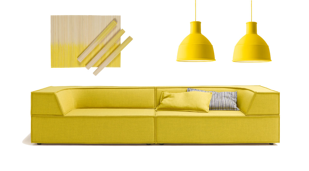
- Detailseite Inhalt (Text) deutsch:
Turquoise whets your appetite for all that is maritime
Turquoise with white accessories, white skirting boards, door frames and window frames invites a light sea breeze into your home. Combined with wood and warm shades of sand, you get that perfect beach vibe.
Turquoise as a wall color
If you opt for turquoise as a wall color, choose a slightly warmer shade with a higher proportion of yellow. Also be sure to paint or wallpaper only one wall with this color, otherwise the room will appear rather cool. And consider that the living room must be very bright and sunny if you want to use turquoise. You may also find it difficult to source accessories in the same color. Blankets and cushions tend to be available only in cooler shades of turquoise.Was passt zu Türkis.
What goes well with turquoise?
White is a good complement to turquoise. Light yellow and dark blue also harmonize with turquoise. The trend of pairing turquoise with mocha tones is not recommended for living rooms in northern Germany as this makes them look gloomy. Shades of nature such as light-toned rattan or wicker, willow, pine or maple go well with turquoise. Black splashes of color as well as small eye-catchers in silver and gold round off a great look.
Turquoise furniture
What holds true for walls also holds true for furnishings: always use turquoise sparingly. A turquoise sofa or armchair can be a wonderful eye-catcher. A large sofa landscape, on the other hand, will tend to overpower the room. The same applies to the floor. An area rug in turquoise brings a breath of fresh air into the living room, while wall-to-wall carpeting may be too much. One-off pieces such as vintage cabinets or chests of drawers painted in
turquoise instead of white could be a nice touch.Meaning of the color turquoise
Blue-green is also called "turquoise" or "cyan". In German, hydrogen cyanide is referred to as “Blausäure” or “blue acid”. Turquoise is associated with contact, communication, inventiveness, grace, self-confidence and cheerfulness as well as with humor and charm.Turquoise also denotes the ability to strike a balance and is said to strengthen artistic and healing abilities. At the same time, turquoise stands for independence, serenity and honesty.
Sea and glacial ice contains this color, as does the shadow of winter and icebergs. Turquoise is therefore considered the coldest of all colors.
The clear, greenish blue symbolizes the delivered soul in some religions.What is your personal favorite color?
Which color breathes new vitality into your life?Take the opportunity to get customized advice from me. I would be pleased to get to know you and put myself at your disposal if you are interested in a color consultation. Here you can find an overview of all my offers and packages. Please give me a call and we can schedule a free, personal preliminary consultation at your home.

- Detailseite Inhalt (Text) deutsch:
Orchid - Magenta
Let friends and inner peace moe into your life. The vividness and friendliness of an orchid’s tropical blossoms will enchant your living space. You’ll find the sunny side of life wherever orchids bloom. Merriment and high-spirits are bound to enrich your life and give you happy hours with friends. In nature, magenta blossoms are connected with joy; they embody idealism, order and empathy. But they are also associated with dominance. Magenta is a protective color that conveys security and gives inner freedom.
Magenta as a wall color
If you opt for magenta as a wall color, limit it to one so-called 'accent wall'. This applies for magenta wallpaper as well. This color would otherwise be much too dominating. A vertical or horizontal stripe would also make a nice accent as would an interesting combination of magenta with white or grey hues.
What’s a good foil for magenta?
White complements magenta very nicely. Pastel tones in grey, any shade of grey, works well with magenta to create a harmonious composition.
Magenta furnitureWhat applies for the wall also applies for furniture: Always use magenta sparingly. An armchair, a small piece of furniture in magenta can be a fabulous eye-catcher. An entire sofa landscape, on the other hand, will come across as too dominant. Dito the flooring. An area rug in magenta brings power to your living room. Wall to wall carpeting would be too much. What is your favorite color?
Which color brings new power into your life?Use this opportunity to get some customized advice. I am looking forward to meeting you and am gladly available for a personal preliminary talk to discuss your plans.
Here you can find an overview of all my offers and packages.
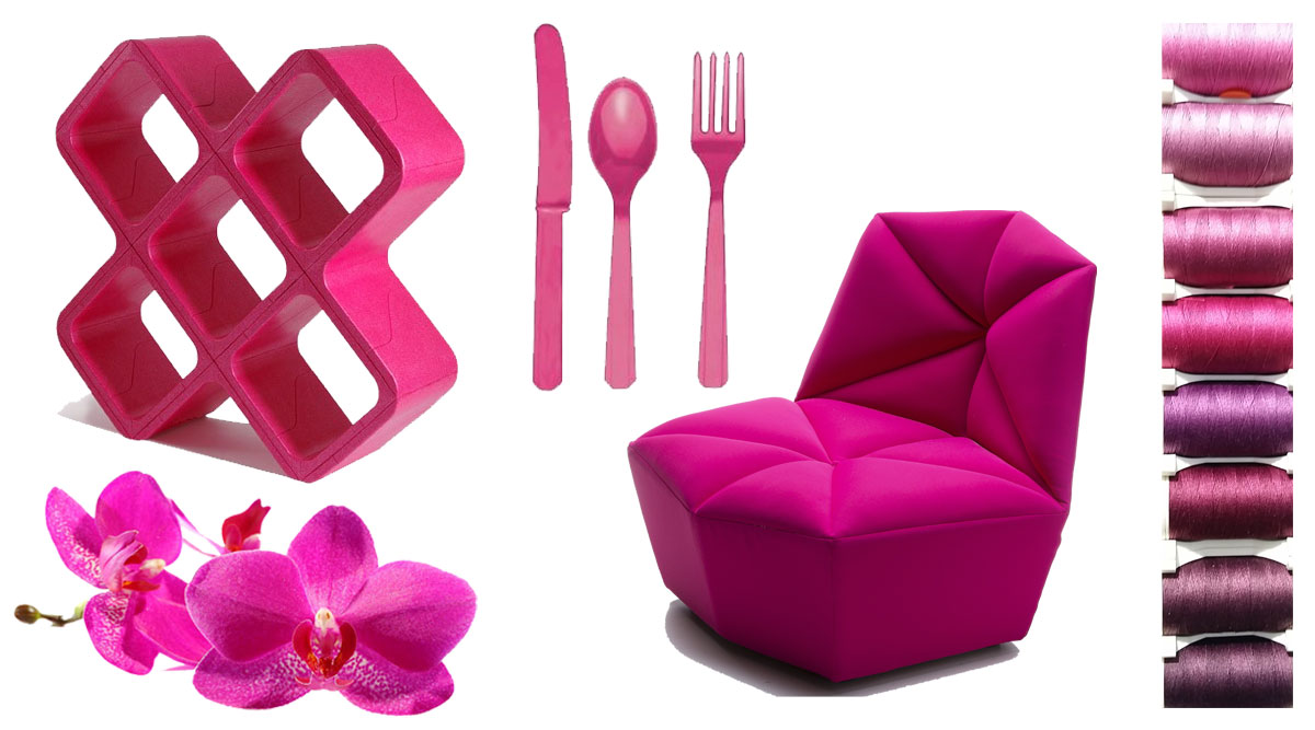
- Detailseite Inhalt (Text) deutsch:
Get in the holiday mood - adding that special touch
The interior of your holiday flat should be so tastefully and suitably designed that guests want to spend time there, regardless of whether they came to work or relax.
Adding a personal touch – or a regional twist – is decisive in determining the character of your holiday flat and reflecting the local culture. These touches can be tailored to your ideas. I can design your holiday flat’s interior based on your ideas. You will be ready to welcome guests there in no time at all.Holiday living - appealing and stylish
Your holiday flat offers countless ways to incorporate your personal style, thus making it a unique place for your guests. When it comes to interior design, there are unlimited options for creating an aesthetic and harmonious living spac
- Listing Bild links - Text rechts (optional):
- Sub Bild (Bild links / Text rechts):
 , Sub Text (Bild links / Text rechts):
First impressions matter. A warm and friendly reception as your guests enter your holiday flat will put a smile on their faces. You can also welcome new guests with a vase of flowers on the table or regional specialties awaiting them in the kitchen., Sub Überschrift (Bild links / Text rechts):
A warm welcome
, Sub Text (Bild links / Text rechts):
First impressions matter. A warm and friendly reception as your guests enter your holiday flat will put a smile on their faces. You can also welcome new guests with a vase of flowers on the table or regional specialties awaiting them in the kitchen., Sub Überschrift (Bild links / Text rechts):
A warm welcome - Sub Bild (Bild links / Text rechts):
 , Sub Text (Bild links / Text rechts):
This is where I want to be – and stay. It is important to welcome your guests with carefully selected feel-good accessories so that nothing stands in the way of a relaxing vacation with a personal favorite spot., Sub Überschrift (Bild links / Text rechts):
The place to be
, Sub Text (Bild links / Text rechts):
This is where I want to be – and stay. It is important to welcome your guests with carefully selected feel-good accessories so that nothing stands in the way of a relaxing vacation with a personal favorite spot., Sub Überschrift (Bild links / Text rechts):
The place to be - Sub Bild (Bild links / Text rechts):
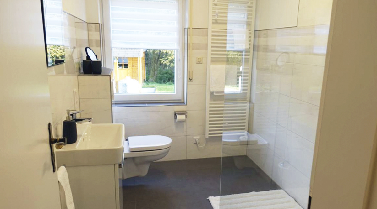 , Sub Text (Bild links / Text rechts):
A well-appointed and clean bathroom is the be-all and end-all. Immaculate, high-quality fittings and fixtures make the bathroom even more welcoming. A bathroom can be seen as the calling card of a holiday flat. A rain shower with a glass partition, soft plain-colored towels, perhaps a bathrobe, a small cosmetics basket and a make-up mirror etc… these things create a sense of luxury.
, Sub Überschrift (Bild links / Text rechts):
High quality bathroom
, Sub Text (Bild links / Text rechts):
A well-appointed and clean bathroom is the be-all and end-all. Immaculate, high-quality fittings and fixtures make the bathroom even more welcoming. A bathroom can be seen as the calling card of a holiday flat. A rain shower with a glass partition, soft plain-colored towels, perhaps a bathrobe, a small cosmetics basket and a make-up mirror etc… these things create a sense of luxury.
, Sub Überschrift (Bild links / Text rechts):
High quality bathroom
- Sub Bild (Bild links / Text rechts):
- Listing Bild oben - Text darunter (optional):
- Sub Bild (Bild oben / Text darunter):
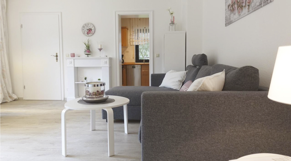 , Sub Text (Bild oben / Text darunter):
Chillout - Cosy - Peaceful - The best Place to be
The living space is beautifully and brightly furnished. Hard-wearing furniture and a few accessories welcome your guests and create a perfect first impression.
Around 90% of holiday flats are designed with hand-me-down furniture and accessories that have outlived their usefulness in your home. This often results in a carelessly thrown-together look that is not inviting – or even off-putting.
Investing in a new interior always pays off in the long term. A modern, coherent look appeals to a more affluent target group. This gives you the opportunity to generate more income with a lower occupancy rate.
- Sub Bild (Bild oben / Text darunter):
- graue box links (optional):
Feeling right at home
When conceiving the interior design of your holiday flat, I put a premium on timeless design and ensuring a feel-good atmosphere for your guests.
I therefore attach great importance to melding great style with superior comfort. - graue box rechts (optional):
One-stop service
If you commission me with the furnishing of your holiday apartment, I can can handle all the professional planning for you as well as realize new design and decorating ideas. Regardless of whether you prefer a classic or creative design, I can turn your ideas into reality.
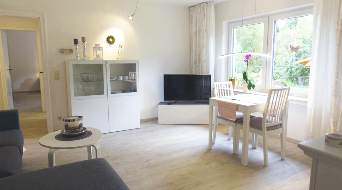
- Detailseite Inhalt (Text) deutsch:
Customized interior design and styling ideas Berlin
No two rooms are the same. In terms of functionality and visual appearance, commercial and residential spaces must satisfy different demands. Create a harmonious retreat with carefully structured and conceived spatial concepts, paired with color accents and hand-picked pieces of furniture and accessories. Personalize the style of your living spaces. Let them evolve with an emphasis on livability and liveliness; let your work spaces become islands of creativity.
Realize your dream home with Dagmar Hankeln’s interior design advice. I will help you to breathe new life into your rooms – residential or commercial – with finesse, creativity and consummate know-how. Together we will create a very personal interior style.
Finding the right interior design consultant
Do you feel like making some changes? You want to redesign your home after just a few years because somehow it no longer fits your needs or lifestyle? You want to change small things to make a big impact? You are looking for professional support and exclusive interior design advice to redesign your apartment or house and turn it into an oasis of well-being? Home Staging 1 is meant for those who want to give their rooms a basic makeover. If you don't even know where to start, Home Staging 2 is the right choice for you. If you don't have the time or inclination, and would like to have everything done by professionals, then Home Staging 3 is your shortcut to the home of your dreams.
My first-class interior design services in Berlin and the wider area will give you a new sense of being with just a few resources. Put your trust in
- a wealth of experience from more than 20 years of work in this business,
- a good eye for harmonious compositions
- planning that is as functional as it is creative,
- my broad network of specialist merchants
- and my client-centric approach
My philosophy
Customized interior design consulting for every home: No matter what your vision is and what your budget is, I can help you achieve a greater sense of well-being in your living spaces. My goal is to create rooms with a personality through harmonious design. Rooms that reflect who you are and from which you can draw new energy.
- Listing Bild oben - Text darunter (optional):
- Sub Bild (Bild oben / Text darunter):
 , Sub Text (Bild oben / Text darunter):
Colorharmony with smooth transitions
Even when each room subscribes to a different color scheme, ensure that the color transitions from room to room are smooth. So-called "moods boards", i.e. color and mood collages for every room, give you a good idea of what your home will look like when finished. From the entrance hall to the kitchen, living room, bedroom and nursery.
- Sub Bild (Bild oben / Text darunter):
- graue box links (optional):
Optimierung Ihrer Räume
Gemeinsam finden wir heraus, welcher Einrichtungsstil am besten zu Ihnen passt, Ihre Wünsche und Vorstellungen für jedes Zimmer. Welche Raumveränderungen sind nötig, damit Sie sich wohlfühlen und Ihre Persönlichkeit sich in Ihrem Zuhause widerspiegelt.
- graue box rechts (optional):
Neue Lebensqualität und Harmonie
Eine professionelle Raumgestaltung verschafft Ihnen eine höhere Lebensqualität, die sich auf auf all Ihre Lebensbereiche auswirkt. Ob Büro, Schlafzimmer, Wohn- und Esszimmer, Küche, Kinderzimmer, Bad jedes Zimmer lässt sich optimal auf Ihre Bedürfnisse abstimmen.
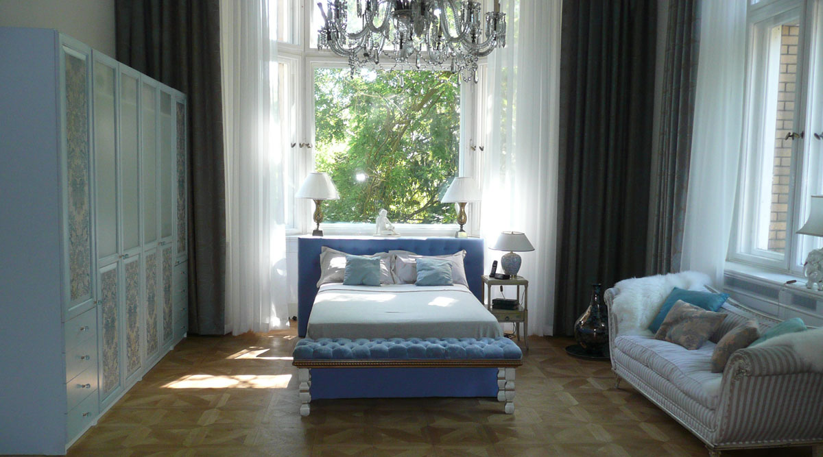
- Detailseite Inhalt (Text) deutsch:
Modern purism in a charming pre-war apartment
A beautiful view that sweeps from the door to the open kitchen all the way to the guest room at the back. By removing a wall from the so-called "Berliner Zimmer" with its poor natural light (it looks out onto the courtyard as it connects the street-facing part of the residential building with a side wing), we have created a spacious, light-flooded living area. The yellow USM Haller sideboard is an exciting eye-catcher.
This masculine interior design is characterized by straight lines and clear structures: Timeless design, comfortable, high-end and straightforward. Everything bases on comfortable, no-frills functionality in a kitsch-free environment; indeed, a masculine abode. The focus is on minimalist design that can be spiced up with one-off items sourced at a flea market or, as here, with bold photos and pictures. This is how expressive spaces with a focus on the essentials emerge.
Which colors define the masculine style?Masculine apartments typically rely on a discreet color scheme. A neutral color palette ranging from black, grey, anthracite to white wins the day. What you won't find in a masculine space are flashy, gaudy colors. Here the color yellow serves as a statement and provides a small accent to each room.
- Listing Bild links - Text rechts (optional):
- Sub Bild (Bild links / Text rechts):
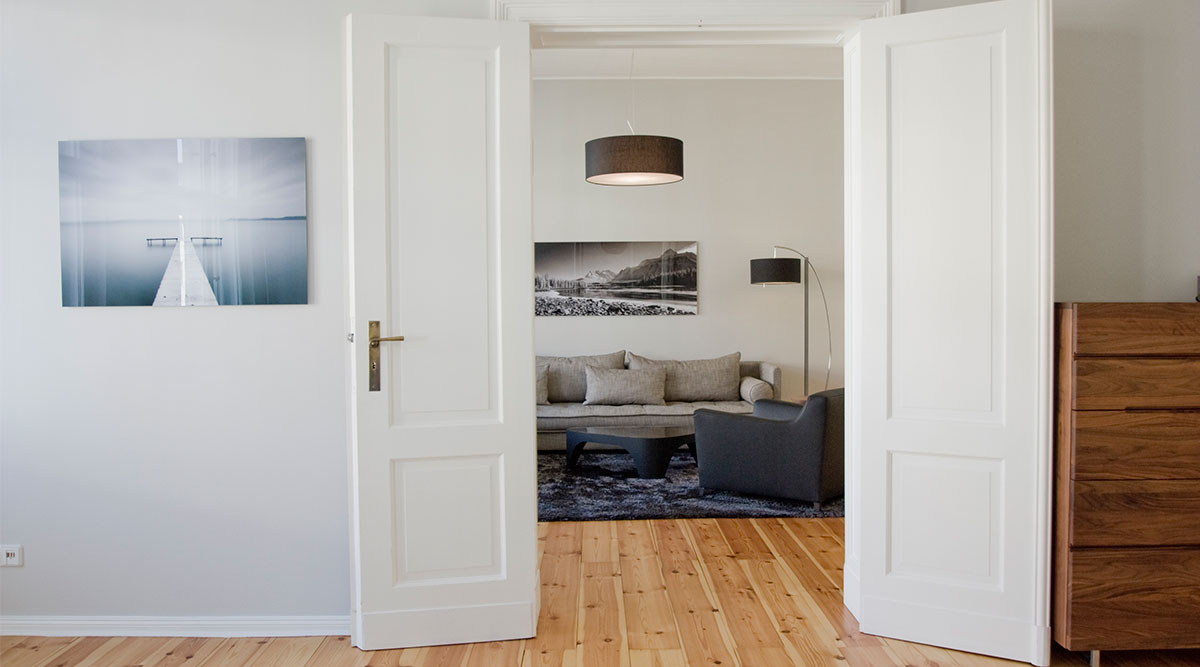 , Sub Text (Bild links / Text rechts):
A wonderful view through the French door – or double door – into the living room. The furniture in the living room is by Ligne Roset; both landscape photos are by Lumas. The photo on the left introduces a pleasant calm to the room. The walnut sideboard on the right was sourced from Minimum in Living Berlin., Sub Überschrift (Bild links / Text rechts):
View from the French door
, Sub Text (Bild links / Text rechts):
A wonderful view through the French door – or double door – into the living room. The furniture in the living room is by Ligne Roset; both landscape photos are by Lumas. The photo on the left introduces a pleasant calm to the room. The walnut sideboard on the right was sourced from Minimum in Living Berlin., Sub Überschrift (Bild links / Text rechts):
View from the French door - Sub Bild (Bild links / Text rechts):
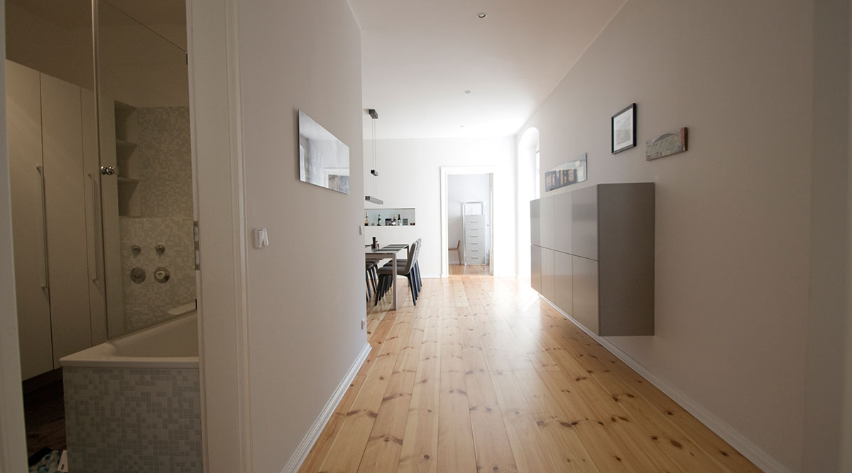 , Sub Text (Bild links / Text rechts):
The so-called "Berliner Zimmer" (Berlin room) was opened up here by removing the door to the open-plan kitchen/living room thus also creating a spacious hallway. This produces wonderful lines of sight from the living room across the hallway to the guest room at the back. Here, too, a discreet light grey was the color of choice., Sub Überschrift (Bild links / Text rechts):
Open hallway - typical Berlinr
, Sub Text (Bild links / Text rechts):
The so-called "Berliner Zimmer" (Berlin room) was opened up here by removing the door to the open-plan kitchen/living room thus also creating a spacious hallway. This produces wonderful lines of sight from the living room across the hallway to the guest room at the back. Here, too, a discreet light grey was the color of choice., Sub Überschrift (Bild links / Text rechts):
Open hallway - typical Berlinr - Sub Bild (Bild links / Text rechts):
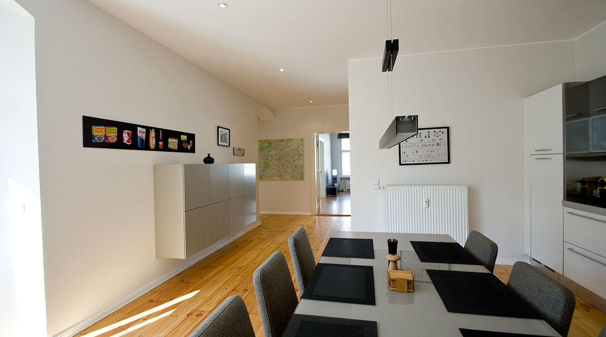 , Sub Text (Bild links / Text rechts):
Here the Berliner Zimmer serves as an open-plan family kitchen and forms the flat's central gathering point. Featuring a flexible dining table by Ligne Roset, which can be doubled to 3 meters if needed, it is the perfect table for a large family get-together. The photo shows it extended to a length of 2m., Sub Überschrift (Bild links / Text rechts):
Open kitchen / living room
, Sub Text (Bild links / Text rechts):
Here the Berliner Zimmer serves as an open-plan family kitchen and forms the flat's central gathering point. Featuring a flexible dining table by Ligne Roset, which can be doubled to 3 meters if needed, it is the perfect table for a large family get-together. The photo shows it extended to a length of 2m., Sub Überschrift (Bild links / Text rechts):
Open kitchen / living room - Sub Bild (Bild links / Text rechts):
 , Sub Text (Bild links / Text rechts):
The photo of iconic East German food products from the 70s was taken by myself. Hearing about my client‘s first visit to East Berlin in 1978 inspired the idea for this collage. It is one-of-a-kind and was a special surprise – and keepsake – for my client. , Sub Überschrift (Bild links / Text rechts):
East German food product art
, Sub Text (Bild links / Text rechts):
The photo of iconic East German food products from the 70s was taken by myself. Hearing about my client‘s first visit to East Berlin in 1978 inspired the idea for this collage. It is one-of-a-kind and was a special surprise – and keepsake – for my client. , Sub Überschrift (Bild links / Text rechts):
East German food product art - Sub Bild (Bild links / Text rechts):
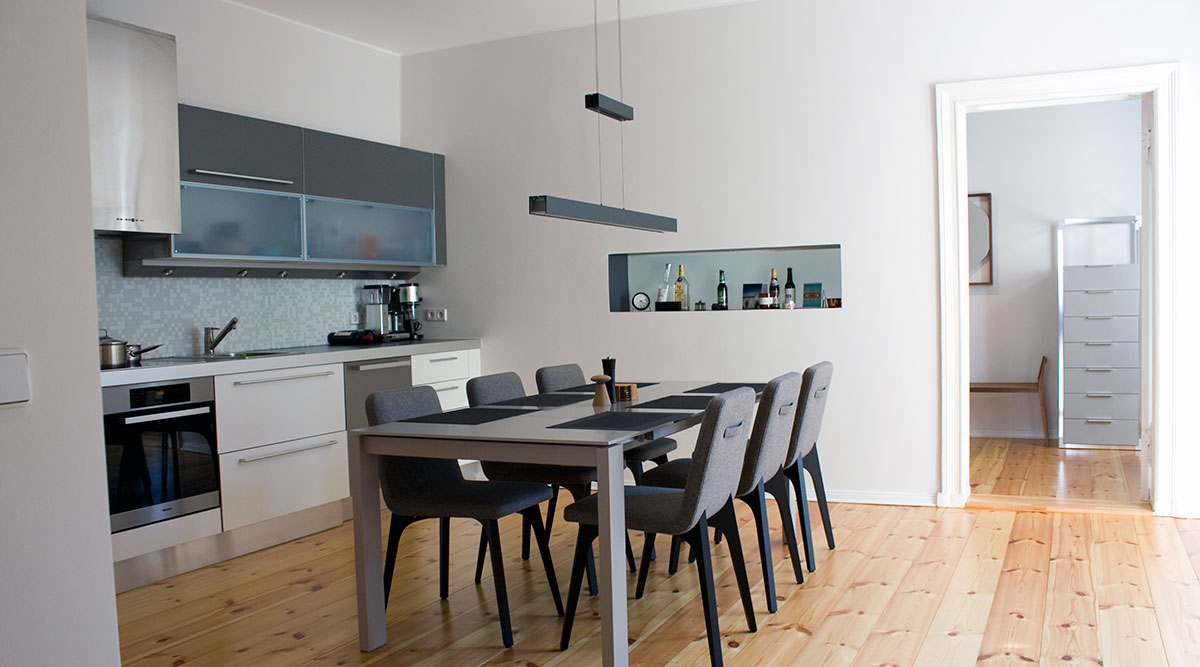 , Sub Text (Bild links / Text rechts):
Kitchen-living room illuminated recess. We incorporated a wall recess into the back wall of the rear room. It is perfect for storing spices and drinks and can also be illuminated through the frosted glass pane from the rear room., Sub Überschrift (Bild links / Text rechts):
Illuminated recess
, Sub Text (Bild links / Text rechts):
Kitchen-living room illuminated recess. We incorporated a wall recess into the back wall of the rear room. It is perfect for storing spices and drinks and can also be illuminated through the frosted glass pane from the rear room., Sub Überschrift (Bild links / Text rechts):
Illuminated recess - Sub Bild (Bild links / Text rechts):
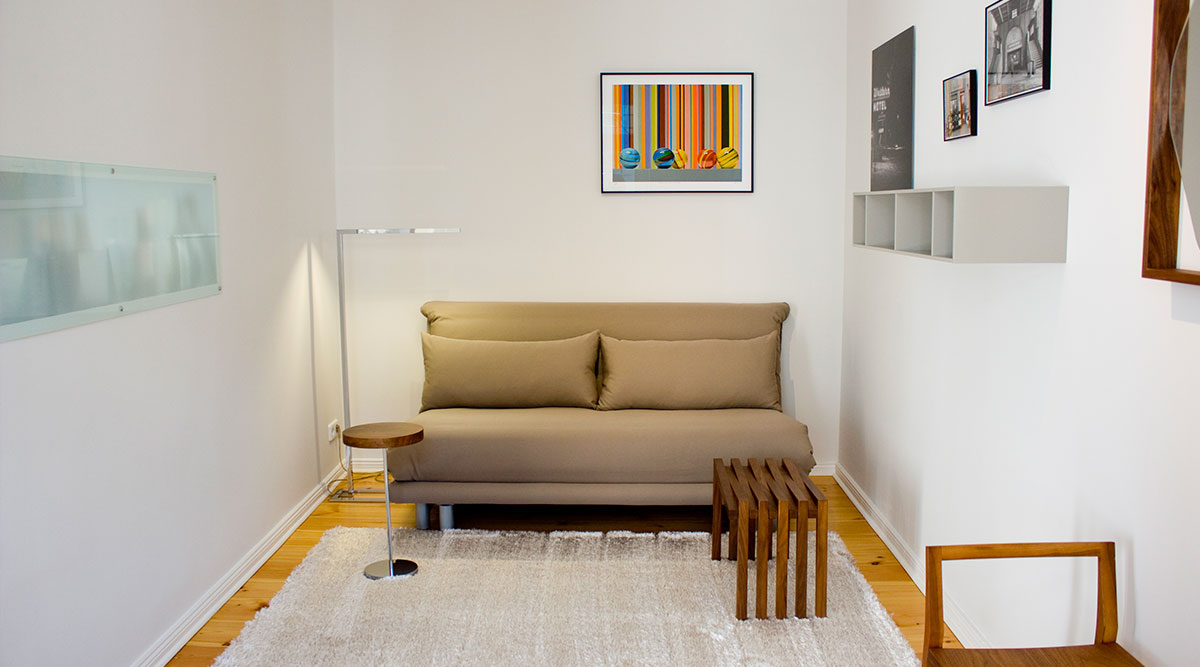 , Sub Text (Bild links / Text rechts):
The "Multy" sofa bed by Ligne Roset is a classic. The perfect sofa for small spaces, it offers a sleeping area of 160x200. The only color accent here is deliberately highlighted with a piece of art by Corky Cholakian from L.A., Sub Überschrift (Bild links / Text rechts):
Guest are always welcome
, Sub Text (Bild links / Text rechts):
The "Multy" sofa bed by Ligne Roset is a classic. The perfect sofa for small spaces, it offers a sleeping area of 160x200. The only color accent here is deliberately highlighted with a piece of art by Corky Cholakian from L.A., Sub Überschrift (Bild links / Text rechts):
Guest are always welcome
- Sub Bild (Bild links / Text rechts):
- Listing Bild oben - Text darunter (optional):
- Sub Bild (Bild oben / Text darunter):
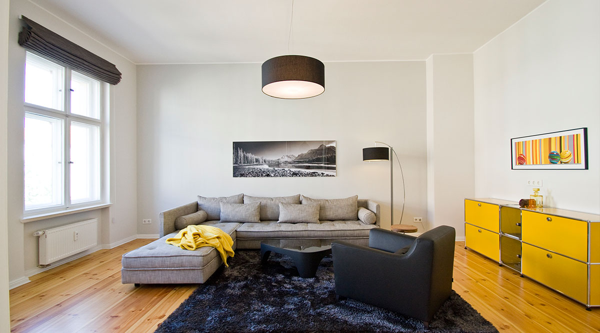 , Sub Text (Bild oben / Text darunter):
Modern apartment Design with pre-war charme
Timeless furniture design by Ligne Roset and the USM Haller sideboard in bold yellow create a classy flair. The black, grey and white color scheme was deliberately chosen to set off the yellow accent to perfection. The artwork above the yellow USM Haller model was specially created by L.A.-based artist Corky Cholakian.
- Sub Bild (Bild oben / Text darunter):
- graue box links (optional):
Optimizing your rooms
We will work together to establish which furnishing style suits you best, taking into consideration your preferences and ideas for each room. We will work out which changes need to be made to arrive at rooms that make you feel comfortable.
- graue box rechts (optional):
A new quality of life and harmony
A professional interior design gives you a higher quality of life and this in turn affects all areasof your life. Whether it is an office, bedroom, living and dining room, kitchen, nursery or bathroom, every room can be optimally adapted to your needs.

- Detailseite Inhalt (Text) deutsch:
Instead of Wallpaper - Shabby Chic Walls
Removing old wallpaper to reveal unfinished plaster walls – walls with real patina – has a fabulous effect in pre-war apartments. Sometimes several layers of old wallpaper from different eras come to the fore. Depending on the wallpaper’s motif and condition, you could even consider leaving a piece of it on the wall. This will underscore and preserve your apartment’s unique history. Especially in Berlin, wonderful old East German wallpaper motifs that you won’t be able to find anywhere else in this day and age crop up occasionally. As a prop master / film set designer and expert for historical films, I have a weakness for living spaces that reveal this kind of travel through time.
Even though shabby chic style is, in the meantime, starting to fall out of fashion a bit, wall design with patina is always a wonderful, economical, exciting and customized wall solution. Unfortunately, we weren‘t able to preserve any of the old wallpaper rests in this pre-war flat in Berlin. But the unfinished plaster wall with patina that emerged lends the apartment a very earthy character. If you opt for this kind of wall design, your credo should be: "sometimes less is more". The more you let yourself be guided by minimalism in terms of furniture and accessories, the clearer your living experience will be. Depending on the look of the unfinished plaster surface that emerges, it may be necessary to smooth the sections that are too restless.
Beautiful original parquet flooring materialized in the living room when the carpeting was removed in this pre-war apartment in Berlin. In other parts of the apartment, old floor boards in good condition revealed themselves. For them to be restored to their former glory all that remained to do was sanding and refinishing them.
To renovate and remodel economically and as quickly and as possible, many construction companies radically rip out original features and detailing in old apartments as they are transformed. Much of the lovely old-style flair of pre-war apartments in Berlin is lost this way. As a room designer with historical awareness, I try to preserve as much as possible of the original features in order to show them off within a new setting, staged with very modern furniture and accessories.
Unfortunately, most of the old coal-burning ovens that used to be so ubiquitous in old residential buildings in Berlin have already been removed. A part of history is simply extinguished. For this reason, especially in West Berlin’s Charlottenburg district, we have very consciously decided to preserve the beautiful ornamented tiled stoves even though they are no longer used for heating purposes.
Currently I am working on an apartment from the 60s with beautiful built-in wardrobes/cupboards in immaculate condition and with unique detailing. My client wants to rid the flat of these features but I am hoping to persuade him otherwise because I consider it a duty to preserve some of our old heritage. Admittedly not everything can be preserved. But a mix of typical construction elements that reflect the spirit of their age and purist luxe furniture and accessories will allow just about any old room to shine in a whole new light.
I will gladly make myself available for an on-site consultation with you.
The following entries from my interior style news might be of interest to you:
- Listing Bild oben - Text darunter (optional):
- Sub Bild (Bild oben / Text darunter):
 , Sub Text (Bild oben / Text darunter):
"Sometimes less is more"
In this particular living room, you can see quite clearly that family heirlooms, such as this beautiful piano and an old sewing machine table, can be combined perfectly with Ikea furniture.
An overview of my services
With finesse, creativity and know-how in connection with eclectic room concepts, I can help your revive your living spaces! Customized to your desires, I offer you the following services in and around Berlin as part of my room concepts:
- Developing a color concept
- Ideas for fabrics and material selection
- Pattern/fabric samples
- Product research and product recommendations
- Floor plan optimization
- Shopping assistance
- Home moving organization
- Renovation services
- Decoration/ Highlights
- Lighting
- Photography
- Visualization with 3D model
- Home Staging
- Sub Bild (Bild oben / Text darunter):
- Detailseite Inhalt (Text) deutsch:
Eclectic design styles – dare to be unusual
The colorful and unconventional eclectic kitchen pictured above is in a 4-person, flat-sharing community; it’s a particularly lovely example of an eclectic kitchen. It features a kitchen island with eye-catching custom-made drawers as the main attraction. The dishwasher is installed in the back of the kitchen island and thus concealed from view.
The large rustic square table in the foreground features a sawn table surface and lends itself to communal meals for 8-10 people. If you like things more cozy, it offers space for even more people than that. The old Thonet chairs were salvaged from a pub liquidation and cost next to nothing. This generously-dimensioned eclectic kitchen makes a great location for cocktail parties or even a dance party should additional friends get invited.
The cupboard in the recessed wall is by Kare Design and offers lots of storage space for all the dishes. This uplifting eclectic kitchen thrives on colors, which also come from the ubiquitous colorful dishes. They turn even a bowl of müsli and a cup of coffee into a nice treat.
Eclectic highlights are provided by the two red ceiling lamps that were scoured at a flea market. They not only provide good light for working but, thanks to the red acrylic lampshades, also create a cozy atmosphere.
Be more daring and add a splash of color to your life! Each colorful day will be a happier one!
Is your apartment still in its self-discovery phase? Does unconventionality, creativity, freedom & a knack for improvisation describe your nature best? Find out more about eclectic interiors here!
Eclectic: Furnishing your home in an original, unconventional & personalized way
Eclectic is defined as a personal mix of original, one-of-a-kind pieces of various styles, epochs, colors, shapes and materials. An eclectic furnishing style is a high-contrast combination of modern and traditional, ethno and natural elements, antiques and art.
The world’s great diversity mirrored in your own home, a home where classic meets pop art meets romantic meets futurism meets shabby chic meets minimalism meets colonial style meets Asia style meets cottage style meets Danish teak meets Moroccan style meets Art Nouveau meets Mediterranean meets vintage. All to your heart’s desire. While this style may sound a bit chaotic, it works wonderfully if you stick to a few important guidelines. Click here to get some eclectic furnishing ideas!
Rooms for aesthetes and free spirits
As with Bohemian décor, individuality and free-spiritedness are also at center stage when it comes to eclectic interiors. To put it simply: The eclectist creates a unique style mix by drawing on various styles and elements. He seeks out the pieces that best suit him, regardless of where they are from, and repurposes them as desired.
More concretely, you can place one-off vintage furniture and modern pieces together with minimalist or futuristic elements in the very same room. An eclectic furnishing style would also allow you to combine rustic, country-style furniture with traditional Arabic pieces without having this look appear "overloaded". If you are going for an eclectic look you can – well, actually, you should – use bold colors and a mix of patterns. There are, however, a few aspects that you must heed if you want to achieve harmonious diversity rather than chaos or randomness:
How to furnish and decorate your home for a controlled eclectic look
- Start with the background, which should be kept neutral.
- Decide which (large) piece of furniture should be the main attraction and set the tone for the entire room (for example, in the bedroom, this might be the bed).
- Try to find a balance between the guiding element and the other elements you buy using, for example, similar materials, colors, textures or forms. Make sure that there are unifying elements so that a common thread is noticeable (for example, statues from various cultures crafted of the same material).
- Use decorative accessories such as pictures, curtains, candles, pillows, throws etc for the final touches.
- Listing Bild links - Text rechts (optional):
- Sub Bild (Bild links / Text rechts):
 , Sub Text (Bild links / Text rechts):
A flea market is the perfect place for hunting down special, one-of-a-kind items. To source such items in Berlin try the following flea markets: Mauerpark, Arkonaplatz flea market, Revier Südost (Griessmühle), antique market at Ostbahnhof, market at Straße des 17. Juni, Boxhagener Platz and the Schöneberg flea market. And keep in mind that it’s the early bird that catches the worm!, Sub Überschrift (Bild links / Text rechts):
Cool flea market style
, Sub Text (Bild links / Text rechts):
A flea market is the perfect place for hunting down special, one-of-a-kind items. To source such items in Berlin try the following flea markets: Mauerpark, Arkonaplatz flea market, Revier Südost (Griessmühle), antique market at Ostbahnhof, market at Straße des 17. Juni, Boxhagener Platz and the Schöneberg flea market. And keep in mind that it’s the early bird that catches the worm!, Sub Überschrift (Bild links / Text rechts):
Cool flea market style
- Sub Bild (Bild links / Text rechts):
- Listing Bild oben - Text darunter (optional):
- Sub Bild (Bild oben / Text darunter):
 , Sub Text (Bild oben / Text darunter):
Eclectic room concepts
Would you like professional support to achieve an eclectic interior design? Realize your dream home with the help of interior design concepts by Dagmar Hankeln Raumdesign!
An overview of my services
With finesse, creativity and know-how in connection with eclectic room concepts, I can help your revive your living spaces! Customized to your desires, I offer you the following services in and around Berlin:
- Developing a color concept
- Ideas for fabrics and material selection
- Pattern/fabric samples
- Product research and product recommendations
- Floor plan optimization
- Shopping assistance
- Home moving organization
- Renovation services
- Decoration/ Highlights
- Lighting
- Photography
- Visualization with 3D model
- Home Staging
- Sub Bild (Bild oben / Text darunter):

- Detailseite Inhalt (Text) deutsch:
"Living Hygge" - Wellness for your soul
"Hyggelig" is when coming home really feels like coming home. Our everyday life is hectic – that’s why hygge furnishing style could be seen as an alternative concept in our fast-paced world. Those who live "hyggelig" celebrate the here and now; they live for the moment and consciously savor the present with friends and family.
Hygge as a philosphy of life
This concept originated in Scandinavia, more precisely in Denmark, and it has long since developed into an attitude towards life. The word "hygge" unites numerous positive connotations such as "pleasant" and "comfortable". It can best be translated as "coziness". The hygge style fulfills the need for security. Sitting back on the sofa with a loved one and a warm drink sums up the charm of this room concept. The focus is on creating a space where mankind and nature can exist in harmony and where negative thoughts and feelings are held at bay. It’s both a location and a condition. It helps one to enjoy the small pleasures and everyday things that inspire happiness: A warm drink in your hand, a blanket draped around your shoulders, a pleasant smile, an enveloping light and the fragrance of freshly-baked treats – this is the scenario that is drawn by the term "hygge". Incidentally, there is a very similar concept in Sweden that is referred to there as "lagom".
The hygge look from Denmark: Light, colors & wood
How can you de-stress on your doorstep? How can you create a basis for a cozy interior design? Opting for the hygge style means, above all, selecting light colors, carpets and a straightforward design for your furniture and decorations. It’s the little things that make your rooms more "hyggelig": Candles, a bowl for fruit or homemade cookies, pillows, woollen socks and fluffy blankets radiate an ambience of comfort. The advantage of the hygge furnishing style: This concept doesn’t exhaust itself in a particular room, such as a living room; it can be extended to your entire living space or office space. Why not make your office hyggelig as well? We do, after all, spend the greater part of our days there!
Feeling happy despite the dreary weather
Rooms designed in hygge style emanate a sense of well-being particularly on gray, autumn days; they practically invite you to make yourself comfortable on your homey sofa. The effect of a fireplace for complete hygge-style happiness cannot be underestimated. Time spent in front a blazing fire and crackling logs completes the homey vibe. Find out more about how you can create a homey vibe, with or without a fireplace.
Furnishing your home hygge-style
- Hygge colors: White and pastel colors bring more light into a room and create a light touch optically. Fresh blue, red and yellow shades add harmonious accents.
- Wood: To ensure that a room doesn’t look sterile, be sure to use furniture and decorative elements made of wood. This gives a room warmth and texture.
- Decorative accessories: Pillows with soft covers, wool carpets and cozy sofa and armchair coverings enhance the hyggelig atmosphere. Also decorate the rooms with natural materials like boughs, stones or handcrafted items.
- Hygge light: Warm lights from candles, table and floor lamps. Indirect lighting is the catchword here.
- Scandinavia in your own home: Let yourself be inspired by classic Scandinavian furniture from the 60s and 70s. The egg chair is a particularly good match for hygge style.
- The "little something extra": Scatter accessories with an antique patina throughout the room to give your interior design an individual touch
- Coziness limit: Start out small and move ahead slowly when it comes to homey accessories. A few candlesticks on a natural wood table in the living room and a comfortable throw on the sofa may be enough to dispel cold, dark autumn nights. The important thing is to find a good balance.
- Listing Bild links - Text rechts (optional):
- Sub Bild (Bild links / Text rechts):
 , Sub Text (Bild links / Text rechts):
Especially grey autumn days lend themselves to embracing hygge style for your home. Incorporating hygge decor lets your create a cozy and comfortable atmosphere for sofa lounging at home. An inviting and comfy vibe is helped along with such materials as linen, wool and natural grasses. Snuggling in a woolen blanket with a cup of tea for complete hygge bliss., Sub Überschrift (Bild links / Text rechts):
Hygge-feeling on a rainy day
, Sub Text (Bild links / Text rechts):
Especially grey autumn days lend themselves to embracing hygge style for your home. Incorporating hygge decor lets your create a cozy and comfortable atmosphere for sofa lounging at home. An inviting and comfy vibe is helped along with such materials as linen, wool and natural grasses. Snuggling in a woolen blanket with a cup of tea for complete hygge bliss., Sub Überschrift (Bild links / Text rechts):
Hygge-feeling on a rainy day - Sub Bild (Bild links / Text rechts):
 , Sub Text (Bild links / Text rechts):
"Illums Bolighus" a Scandinavian shop, is an absolute must for your hygge world. This is where you can find Danish-designed furniture classics, lighting, accessories and more. Illums Bolighus' original flagship shop is located at Amagertorv 10 in the center of Copenhagen. The Illums Bolighus Hamburg is located at Neuer Wall 54., Sub Überschrift (Bild links / Text rechts):
"Illums Bolighus" Danish-Design
, Sub Text (Bild links / Text rechts):
"Illums Bolighus" a Scandinavian shop, is an absolute must for your hygge world. This is where you can find Danish-designed furniture classics, lighting, accessories and more. Illums Bolighus' original flagship shop is located at Amagertorv 10 in the center of Copenhagen. The Illums Bolighus Hamburg is located at Neuer Wall 54., Sub Überschrift (Bild links / Text rechts):
"Illums Bolighus" Danish-Design
- Sub Bild (Bild links / Text rechts):
- Listing Bild oben - Text darunter (optional):
- Sub Bild (Bild oben / Text darunter):
 , Sub Text (Bild oben / Text darunter):
Hyggelig spaces concepts
Would you like professional support to achieve an hugge interior design? Realize your dream home with the help of interior design consulting by Dagmar Hankeln Raumdesign!
An overview of my services
With finesse, creativity and know-how in connection with hyggelig spaces room concepts.
I can help your revive your living spaces! Customized to your desires, I offer you the following services in and around Berlin:- Developing a color concept
- Ideas for fabrics and material selection
- Pattern/fabric samples
- Product research and product recommendations
- Floor plan optimization
- Shopping assistance
- Home moving organization
- Renovation services
- Decoration/ Highlights
- Lighting
- Photography
- Visualization with 3D model
- Home Staging
- Sub Bild (Bild oben / Text darunter):

- Detailseite Inhalt (Text) deutsch:
Creating a feel-good atmosphere
Whether from an estate agent's or an owner's perspective, the influence of professional Home Staging on prospective buyers is all too often underestimated. When marketing condominiums and single-family homes, and sometimes even commercial properties, estate agents and private sellers in the US have been making use of home staging for years – to the delight of future occupants. In the meantime, the trend has been sweeping over Germany too, at least in such urban centers as Berlin, Hamburg, Cologne, Frankfurt, Stuttgart and Munich.
However, there are still too few players in the real estate sector who recognize the vast potential that is waiting to be exploited. A staged property simply sells faster and at a better price. The "homify" principle not only benefits both sellers and buyers in financial terms. Indeed, my blog-article Before-and-After Living Area shows the evolution of a bare brickwork "living room" to a delightful, fully-staged final result.
With the support of professional home stagers, residential spaces are easily transformed into dream homes. The focus of all home staging projects is the establishment of neutral but inviting interiors: This type of real estate presentation is intended to give a wide range of potential buyers the opportunity to imagine themselves in each room. Indeed, many people need a little jolt so that they can see the potential of each room in an empty apartment. In a home staged apartment, this becomes instantly obvious, thus also facilitating the decision to buy. Overall, home staging is always about stimulating the imagination of prospective buyers and emphasizing the desirability of the property.
Benefits of home staging- Vorstellungsvermögen anregen
- vorhandene Vorzüge ins rechte Licht rücken
- ältere Objekte in die Neuzeit “übersetzen”
- neben den Immobilien-Fakten das entscheidende Quäntchen Gefühl vermitteln
- Kauflust steigern: das Objekt verkauft sich “von selbst”
- Preisverhandlungen beeinflussen
- Listing Bild links - Text rechts (optional):
- Sub Bild (Bild links / Text rechts):
 , Sub Text (Bild links / Text rechts):
The view from the sofa towards the kitchen shows that every possible detail has been considered in this apartment. Living area, small desk, kitchen and the sliding door to the bedroom on the right. And yet it still boasts a generous feeling of spaciousness., Sub Überschrift (Bild links / Text rechts):
Small apartment - Grand look
, Sub Text (Bild links / Text rechts):
The view from the sofa towards the kitchen shows that every possible detail has been considered in this apartment. Living area, small desk, kitchen and the sliding door to the bedroom on the right. And yet it still boasts a generous feeling of spaciousness., Sub Überschrift (Bild links / Text rechts):
Small apartment - Grand look - Sub Bild (Bild links / Text rechts):
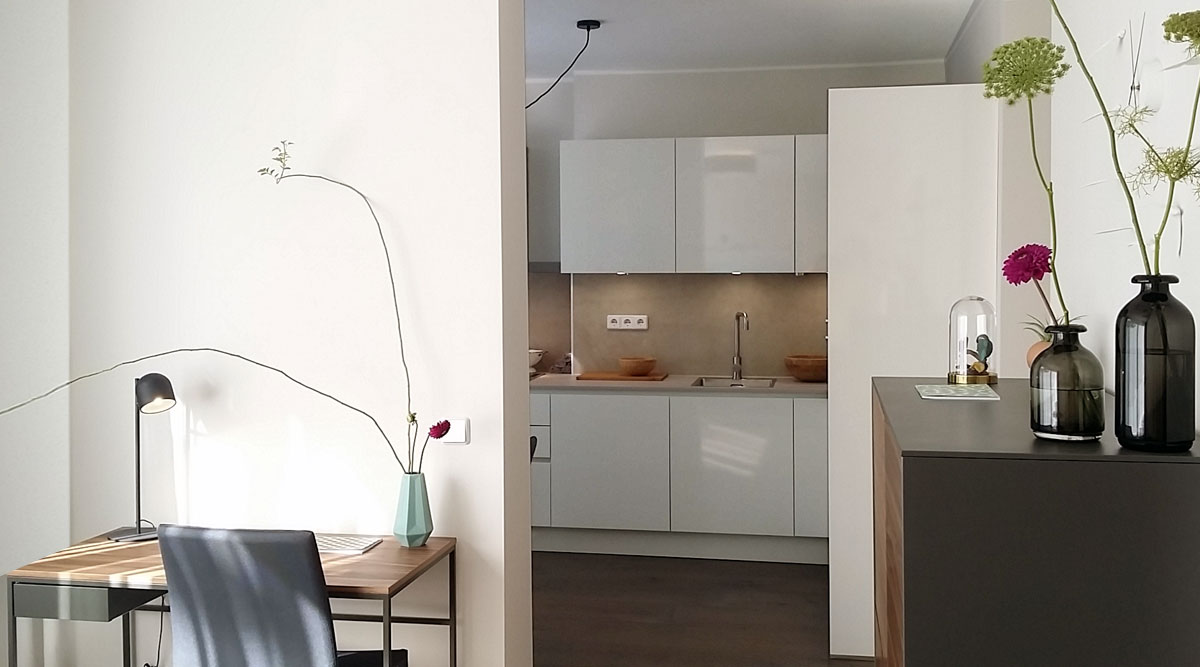 , Sub Text (Bild links / Text rechts):
The small desk with a walnut worktop looks dainty thanks to its black metal frame. Its color matches the black corpus and walnut fronts of the highboard. The drywall behind the desk partitions off the kitchen., Sub Überschrift (Bild links / Text rechts):
Desk or dressing table
, Sub Text (Bild links / Text rechts):
The small desk with a walnut worktop looks dainty thanks to its black metal frame. Its color matches the black corpus and walnut fronts of the highboard. The drywall behind the desk partitions off the kitchen., Sub Überschrift (Bild links / Text rechts):
Desk or dressing table - Sub Bild (Bild links / Text rechts):
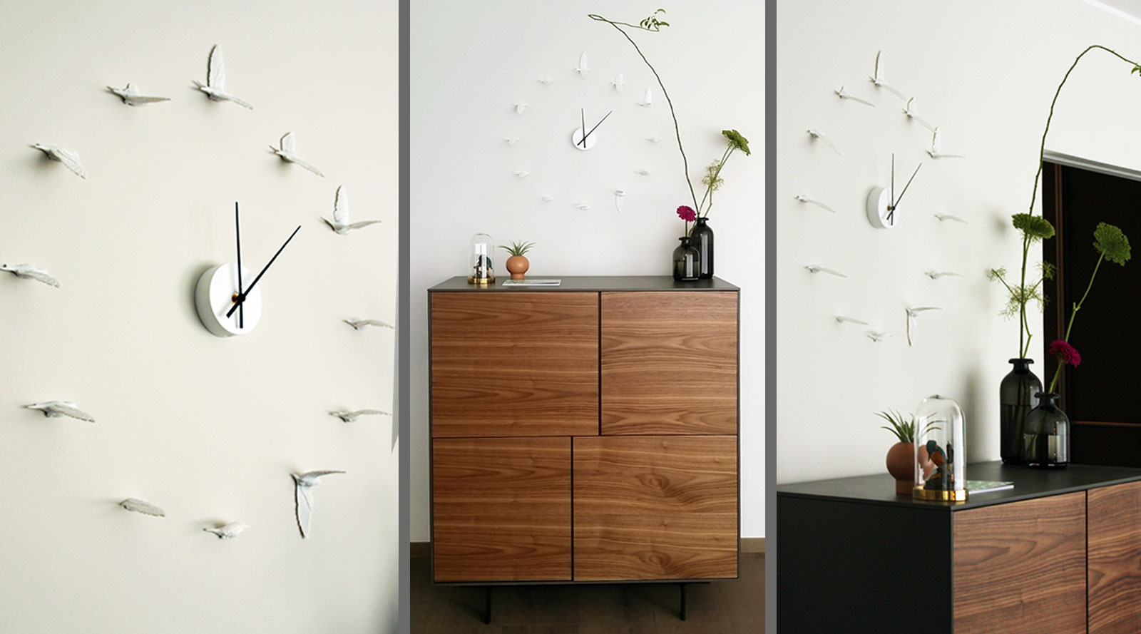 , Sub Text (Bild links / Text rechts):
The walnut highboard is practical and complements the desk. The clock, consisting of flying birds, is a special piece. The white swallows are mounted right on the light wall. The 3D effect is eye-catching and at the same time the birds convey a sense of airy lightness., Sub Überschrift (Bild links / Text rechts):
Flying birds as a wall clock
, Sub Text (Bild links / Text rechts):
The walnut highboard is practical and complements the desk. The clock, consisting of flying birds, is a special piece. The white swallows are mounted right on the light wall. The 3D effect is eye-catching and at the same time the birds convey a sense of airy lightness., Sub Überschrift (Bild links / Text rechts):
Flying birds as a wall clock
- Sub Bild (Bild links / Text rechts):
- Listing Bild oben - Text darunter (optional):
- Sub Bild (Bild oben / Text darunter):
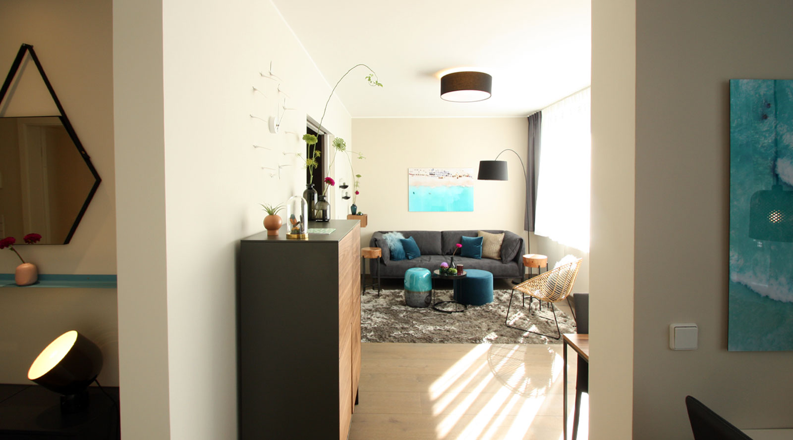 , Sub Text (Bild oben / Text darunter):
The first impression of the spacious living room matters
There is no second chance to make a first impression. The prospective buyer is usually already familiar with all the facts from the exposé. Why are photos on real estate portals so essential for the sales process? Why do interested parties want a showing by the estate agent? It is because they need to get a feel for the property apart from the facts made available. As a rule it is the little things, the small details and the accessories, that bring the overall design to life and evoke that sense of “this is it”.
Home staging services and packages at a glance
Whether furniture or colors, a harmonious and coherent concept is the be-all and end-all when staging a kitchen.
As a professional home stager, I draw on my expertise to imbue your home with a unique look. I offer three different home staging packages:
- Home Staging 1 Basic:
- This package is recommended for owners who want to independently upgrade their occupied property and seek professional advice in doing so.
- Home Staging 2 package:
- This package is aimed at owners who have a rough vision but are unsure how to implement their ideas. Here we work together to realize a concept and prepare the apartment for a profitable sale.
- Home Staging 3 complete package:
- With this stress-free, turnkey package, you entrust the upgrading of your property to professionals. Perfect for busy clients who don't have time but still want to have their home given a unique makeover.
- Home Staging 1 Basic:
- Sub Bild (Bild oben / Text darunter):

- Detailseite Inhalt (Text) deutsch:
Home Staging - Luxury hotel qualaty sleep
The term "home staging" describes the staging of a property aimed at presenting it to best advantage before it hits the market. But home staging is also a good way forward for those who simply want to beautify their home. Making a home "fit for the stage" is done by rearranging individual rooms with their aesthetic appeal in mind. In America, this is a standard procedure because it is known to sell properties more quickly and for a better price.
The first part of this series will focus on home staging in the bedroom. Upcoming blog posts will put a spotlight on other rooms in addition so that an overall cohesive look can be achieved for the entire home. Home staging comes into play above all when an apartment or house is passed into new hands. After all, as with so many things in life, it's the first impression that counts, and this can be optimized with just a few skilful touches.
The added value of home staging for real estate
Home staging's objective is to upgrade bedrooms, living rooms, dining rooms, bathrooms, etc. while creating a cozy atmosphere at the same time. Skillfully staging the interior requires an experienced eye and the know-how of an expert. The main challenge is to carry off a cozy atmosphere while keeping the appeal broad. You don’t want to tailor the look to a specific target group; you want to reach a wide spectrum of potential buyers.
To get a better feel for the concept, try the following mind game: A completely empty bedroom awaits you with white-washed walls. Or picture yourself standing in the middle of a building shell. A feeling of coziness is hard to come by here. In contrast to this, picture a home staged bedroom. It features a soft bed with a lovely bedspread and a plush carpet on the floor. The room is bathed in warm light from little floor lamps. The wall colors accentuate the mood, while little accessories provide the finishing touches to the overall impression. Which bedroom would you rather take a closer look at?
Interior design the inspires the imaginationEven though the focus here is primarily on staging bedrooms, the concept is not limited to individual rooms. It can extend to the living room, kitchen, bathroom, hallway, child's nursery and even the garden. Staging can be done regardless of whether the property is a new-build or an older home, a studio apartment or a detached house. The basic idea behind home staging is as follows: a prospective buyer cannot get a sense of what living in the property could be like when it is presented empty. The imagination is set in motion and a higher degree of identification develops when a property is shown furnished, with lighting and with color in the right places. Home staging thus serves to enhance the appeal of a property and also to support the buyer’s decision-making process.
What a bedroom staging could look like
This is an example of a project I carried out. More references are available on my Home Staging Services page. In the following space several variations are shown. Which option is more likely to convince you to buy the apartment? One side shows a photo of the shell before staging; the other shows the bedroom after the staging process was completed.
- Listing Bild links - Text rechts (optional):
- Sub Bild (Bild links / Text rechts):
 , Sub Text (Bild links / Text rechts):
Warm wall colors, cozy wooden floor. The bed with an upholstered headboard and wooden frame creates a pleasant contrast to the wall color. The shiny, petrol maco-satin bed linen harmonizes with the color scheme of the home-staged apartment., Sub Überschrift (Bild links / Text rechts):
Sleeping on cloud nine
, Sub Text (Bild links / Text rechts):
Warm wall colors, cozy wooden floor. The bed with an upholstered headboard and wooden frame creates a pleasant contrast to the wall color. The shiny, petrol maco-satin bed linen harmonizes with the color scheme of the home-staged apartment., Sub Überschrift (Bild links / Text rechts):
Sleeping on cloud nine - Sub Bild (Bild links / Text rechts):
 , Sub Text (Bild links / Text rechts):
The acrylic wall lights, with their chandelier-inspired shapes, give this bedroom a sophisticated touch and create a cozy atmosphere at the same time. Light sources are another powerful tool for influencing the mood of rooms., Sub Überschrift (Bild links / Text rechts):
Stylish chandelier
, Sub Text (Bild links / Text rechts):
The acrylic wall lights, with their chandelier-inspired shapes, give this bedroom a sophisticated touch and create a cozy atmosphere at the same time. Light sources are another powerful tool for influencing the mood of rooms., Sub Überschrift (Bild links / Text rechts):
Stylish chandelier - Sub Bild (Bild links / Text rechts):
 , Sub Text (Bild links / Text rechts):
The ceiling-high closet was customized to this room. Its aluminum cross lines on the door panels form an optical extension of the upper edge of the bed headboard, creating a uniform line. This unconsciously conveys – to both the resident and prospective buyer – a sense of order and structure
, Sub Überschrift (Bild links / Text rechts):
Clear lines and their effect
, Sub Text (Bild links / Text rechts):
The ceiling-high closet was customized to this room. Its aluminum cross lines on the door panels form an optical extension of the upper edge of the bed headboard, creating a uniform line. This unconsciously conveys – to both the resident and prospective buyer – a sense of order and structure
, Sub Überschrift (Bild links / Text rechts):
Clear lines and their effect
- Sub Bild (Bild links / Text rechts):
- Listing Bild oben - Text darunter (optional):
- Sub Bild (Bild oben / Text darunter):
 , Sub Text (Bild oben / Text darunter):
Kissed by the sun - let the day begin
The view through the sliding door towards the living room and large window front invites you to linger in your bed. And as the sun rises in the morning, it wakes you gently. The built-in sliding door that we installed (as part of the staging) allows blocking out the sun completely if you want to keep sleeping. This small but exquisite bedroom leaves nothing wanting.
Home staging services and packages at a glance
Whether furniture or colors, a harmonious and coherent concept is the be-all and end-all when staging a kitchen.
As a professional home stager, I draw on my expertise to imbue your home with a unique look. I offer three different home staging packages:
- Home Staging 1 Basic:
- This package is recommended for owners who want to independently upgrade their occupied property and seek professional advice in doing so.
- Home Staging 2 package:
- This package is aimed at owners who have a rough vision but are unsure how to implement their ideas. Here we work together to realize a concept and prepare the apartment for a profitable sale.
- Home Staging 3 complete package:
- With this stress-free, turnkey package, you entrust the upgrading of your property to professionals. Perfect for busy clients who don't have time but still want to have their home given a unique makeover.
- Home Staging 1 Basic:
- Sub Bild (Bild oben / Text darunter):

- Detailseite Inhalt (Text) deutsch:
Home Staging - The best way of seeling real estate
What Americans have known – and successfully practiced for decades – was still an insider tip in Germany until a few years ago. Regardless of whether it’s a kitchen, dining room, living room, bedroom, nursery, bathroom, hallway or terrace, staging is the best way to upgrade a unit before presenting it to potential buyers. And it’s the best way to achieve a better sales price.
Whether in the US or here in Germany, every estate agent wants to attract many potential buyers and complete a sale as quickly as possible. With the support of professional home stagers, residential units can easily be transformed into much-coveted real estate. These before-and-after examples speak volumes. Staging helps to
- stimulate the imagination
- put existing advantages into the right light
- give old objects a modern veneer
- convey emotions and drive consumer behavior in addition to available data on the real estate object
- evoke interest in buying the real estate object
- take influence on price negotiations
A neutral but inviting interior design should be at the heart of all home staging projects: This type of real estate presentation ideally allows a wide range of potential buyers to visualize themselves in each of the staged rooms. Vacant rooms are given a discrete but effective makeover or re-styling with furniture and accessories. The overall objective is to stimulate the imagination of potential buyers and emphasize the property's desirability.
Kitchen staging example
Home staging will take its cue from the set of circumstances on hand, i.e. the size of the rooms, the light sources, whether it‘s a single-family home or an urban, open-plan loft. We employed the following concept for this kitchen staging:
Inviting play of colors
We opted for a simple white, high-gloss kitchen without pull handles. White is a timeless color that appeals to a broad target group. White surfaces give the living area a bright and clearly structured look. The marbled splashback and the beige worktop create a cozy atmosphere. These clear, warm colors are offset by turquoise and petrol color accents (see tableware and wall pictures). Turquoise and petrol weave like a thread throughout the home and create a sense of security. The customer/occupant quickly feels at home.
- Listing Bild links - Text rechts (optional):
- Sub Bild (Bild links / Text rechts):
 , Sub Text (Bild links / Text rechts):
White, anthracite, walnut wood, turquoise and petrol pop up throughout this unit, beginning in the hallway, the kitchen (featuring an ocean photo with a vacation atmosphere), the living room and finally the bedroom. The color concept gives residents and prospective buyers alike a coherent and harmonious sense of space., Sub Überschrift (Bild links / Text rechts):
Happy holiday vibes
, Sub Text (Bild links / Text rechts):
White, anthracite, walnut wood, turquoise and petrol pop up throughout this unit, beginning in the hallway, the kitchen (featuring an ocean photo with a vacation atmosphere), the living room and finally the bedroom. The color concept gives residents and prospective buyers alike a coherent and harmonious sense of space., Sub Überschrift (Bild links / Text rechts):
Happy holiday vibes - Sub Bild (Bild links / Text rechts):
 , Sub Text (Bild links / Text rechts):
By choosing just one accent color when staging a space, you can add a certain excitement to any room, as shown here with the use of turquoise. The high-gloss ocean photography provides a sense of clarity, freshness and vibrancy. Turquoise is complemented by matching colors and materials, in this case, warm wall colors, walnut, anthracite, white, turquoise and petrol.
, Sub Überschrift (Bild links / Text rechts):
Ocean fresh - glossy finish
, Sub Text (Bild links / Text rechts):
By choosing just one accent color when staging a space, you can add a certain excitement to any room, as shown here with the use of turquoise. The high-gloss ocean photography provides a sense of clarity, freshness and vibrancy. Turquoise is complemented by matching colors and materials, in this case, warm wall colors, walnut, anthracite, white, turquoise and petrol.
, Sub Überschrift (Bild links / Text rechts):
Ocean fresh - glossy finish - Sub Bild (Bild links / Text rechts):
 , Sub Text (Bild links / Text rechts):
The turquoise picture above the sofa forges a link between the kitchen and living room. Not just by means of the open-plan kitchen, but also through the color scheme and the material mix consisting of fabrics, cushions and ceramics in petrol and turquoise., Sub Überschrift (Bild links / Text rechts):
Subconscious well-being
, Sub Text (Bild links / Text rechts):
The turquoise picture above the sofa forges a link between the kitchen and living room. Not just by means of the open-plan kitchen, but also through the color scheme and the material mix consisting of fabrics, cushions and ceramics in petrol and turquoise., Sub Überschrift (Bild links / Text rechts):
Subconscious well-being
- Sub Bild (Bild links / Text rechts):
- Listing Bild oben - Text darunter (optional):
- Sub Bild (Bild oben / Text darunter):
 , Sub Text (Bild oben / Text darunter):
Let the entrance evoke positive emotions
There is, after all, no second chance to make a first impression. The prospective buyer usually will already be familiar with the exposé and thus the facts and data concerning the property. Why are photos on real estate portals so crucial for the selling process? Why do interested parties request to view the property? It is because they want to get a feel for the property and square this with the facts presented. Generally it is the little things, the accessories that complement the overall concept, that win over a potential buyer.
Home staging services and packages at a glance
Whether furniture or colors, a harmonious and coherent concept is the be-all and end-all when staging a kitchen.
As a professional home stager, I draw on my expertise to imbue your home with a unique look. I offer three different home staging packages:
- Home Staging 1 Basic:
- This package is recommended for owners who want to independently upgrade their occupied property and seek professional advice in doing so.
- Home Staging 2 package:
- This package is aimed at owners who have a rough vision but are unsure how to implement their ideas. Here we work together to realize a concept and prepare the apartment for a profitable sale.
- Home Staging 3 complete package:
- With this stress-free, turnkey package, you entrust the upgrading of your property to professionals. Perfect for busy clients who don't have time but still want to have their home given a unique makeover.
- Home Staging 1 Basic:
- Sub Bild (Bild oben / Text darunter):
