Colors and interior design / Using wall colors to best effect
Delve into the World of Color
The effect of colors on a person’s well-being is enormous. One the one hand, colors have a direct effect on the psyche and, on the other hand, they also influence us indirectly through the room’s atmosphere. The size of a room and the room’s temperature is perceived subjectively by people. Each color has a different effect and thus, each color also gives a room a different feel.
Light colors (yellow, orange, etc.) have the effect of making a room’s dimensions appear bigger. Dark colors, on the other hand, make a room appear smaller. Warm colors (red shades, for example) give the sensation of heat and actually make a room seem warmer while cold colors make a room seem a bit cooler. Pastel tones have a powerful yet delicate effect, which is why I only list the primary colors here.
To help you choose the right wall color intensity, have a small batch of color blended for you at the DIY market. Paint a small wall surface with it and let its impact on you – both in daylight and in artificial light – sink in. A color’s effect will change with the time of day and outdoor light conditions.
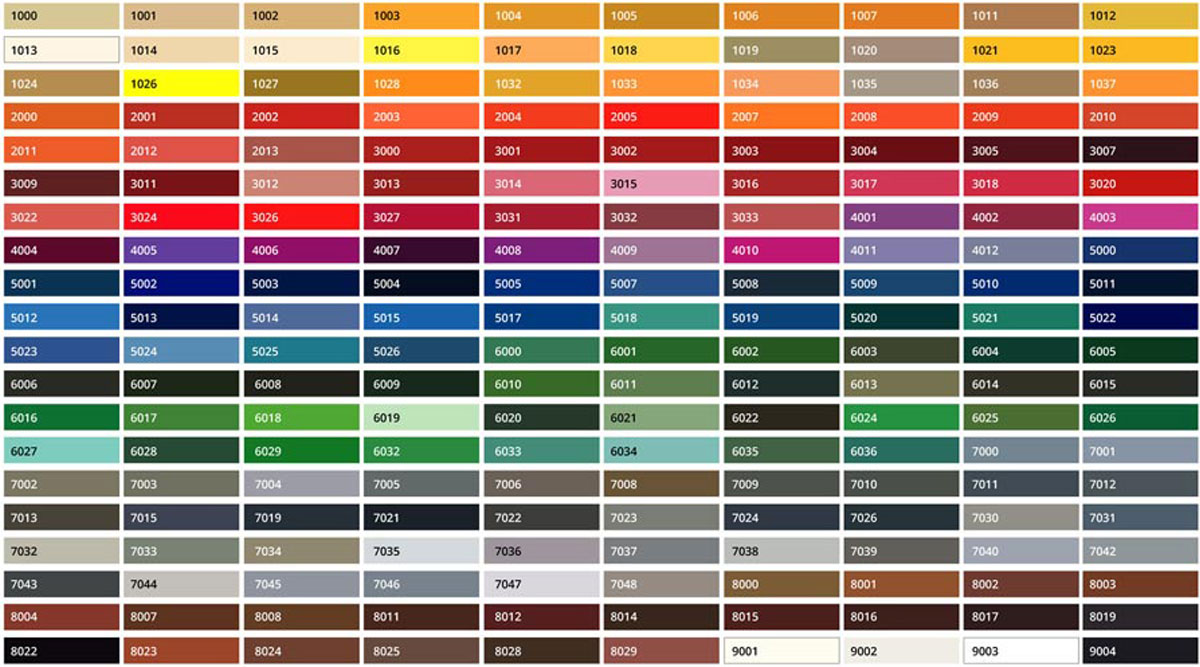
Here’s a little tip when it comes to choosing the wall color: Every DIY market has color charts that you can take home with you. If you opt for one of the colors presented on the chart, have it blended 1 or 2 nuances lighter than the chosen color. That’s because colors will look more intense on a large wall.
And here’s a guide to follow with regard to the effect of certain colors in a room. It will help inspire some interior design ideas.
Yellow brings summer into your rooms
Yellow brings summer, sun and a good mood into your home. Yellow lends a room a sunny, positive atmosphere; it lets small rooms look bigger and it’s both stimulating and revitalizing. It has this effect both on the spirit and on your intellectual activities. The color yellow boosts one’s ability to concentrate and one’s eagerness to learn, thus impacting the brain positively. Yellow stimulates the mind and is conducive to conversation. Yellow even exerts this effect in combination with dark colors. It’s the ideal choice for rooms meant for young people and for conference rooms. Yellow as a wall color is invigorating and warming.
Orange brings cheerfulness into your home
Orange has a stimulating effect, exuding warmth and hygge. It’s a friendly, sociable and nurturing color. Orange also stimulates the appetite and encourages conviviality. When orange is lightened with white it loses its radiance. It’s the ideal color for kitchens and dining rooms and perfect for North-facing rooms with only very little natural light or sun. Orange as a wall color gives a room added warmth.
Red brings power and vital energy
Red is the most dynamic and aggressive of all colors. Red is mentally and physically stimulating in terms of physical labor and movement. When it comes to interior design, red injects dynamism and ideas. Red should not be the dominating color in rooms in which you want to relax because red is pure energy. This color increases the body’s metabolism and stimulates blood circulation. Red stirs passion and a desire for sexual pleasure and it makes people happy. Too much red in a room will make you restless and irritable after a while; it is also a little bit constricting. Red, by the way, also stimulates appetite (just like orange). Individuals who struggle with their weight should opt for blue or blue-green in their kitchens. Red rooms give the sensation of warmth and using a lot of red in a room saves on heating costs. Red as a wall color is rather loud; all all-red room can make it seem like the walls are closing in.
Pink brings love and empathy to your home
Pink is soothing and makes one more receptive to other people’s moods; it breaks down aggression. According to experts, it’s the best color for bedrooms. American basketball teams routinely offer opposing teams pink dressing rooms. Pink as a wall color is delicate, fresh and spring-like.
Violet conveys an almost sacral, classy mood
Violet goes hand in hand with a festive mood. Violet is ceremonious and suitable for reception rooms. When used in living quarters, violet can generate a sacral mood over time. Violet makes one passive and calms one down. Violet is known to rein in appetite and sexual desire alike. This should be kept in mind when planning kitchens, dining rooms and bedrooms. Violet used as a wall color comes across as very classy.
Blue brings clarity and calm
Blue optically enlarges narrow, low-ceilinged rooms. In apartments, blue is dignified and tasteful though it also makes rooms seem cold. Blue that is lightened with white retains its cool, unapproachable effect. Blue is the color of calm, relaxation and equilibrium, trust and harmony. These attributes come into their own wonderfully in bedrooms or the like. Predominantly blue rooms always feel a few degrees colder than they are. Blue as a wall color seems cold and distant.
Green is the color of creativity and regeneration
Green has a calming effect. It creates a good balance, calm, safety and security. Green feeds the soul with good vibes and awakens the desire to discover new things. Green is considered the source of creativity. A green room is restful and invigorating and exerts a regenerating influence on the organism. Green can neither be termed a warm nor a cold color. Shades of green are often experienced as equalizers between two poles; they are friendly and relaxing. Tinting it with blue makes green much colder and more aggressive. Green is ideally suited for interiors that should radiate peace and be mentally and artistically stimulating alike. Fresh, light green – whether as a color or a plant – should never be in short supply. Green as a wall color feels like being enclosed by a hedge.
Brown, ochre and sienna are grounding and bring one close to nature
Brown as a color for a room lends it a rustic character and radiates coziness. Earthy hues including ochre, sienna and umbra are warming and muting at once; they are calming and have a balancing effect. Earthy tones are very versatile in interior designs. Brown tones for the wall: – Light tones are somewhat invigorating; darker tones appear solid and compact.
White used as a background color is the perfect basis
White as the neutral room color.White, black, grey – the noncolors.
White, black and grey are among the so-called "noncolors". They are ideal combination colors. Too much black and grey, however, should be rejected as too dark and heavy. White may be a neutral color but it plays a leading role in colorful interior design by neutralizing, brightening or enlivening other color groups.Grey as a wall color is perceived as neutral.
Black as a wall color has an inverting effect.
Which color is the most effective for your living space?
Use this opportunity to get some customized advice. I am looking forward to meeting you and am gladly available to you for Home Staging and other interior design services. Please contact me for a preliminary talk so that we can discuss your plans.
Read more about the effect of colors and let me inspire your with my blog entries on Color Consulting and Interior Design Consulting!